Behind every typeface lies a world of experimentation, creative decisions, technical precision, and countless hours of refinement. For German type designer Felix Braden, founder of independent type foundry Floodfonts, designing letters is as much about personality and expression as it is about making typography work in the real world.
Since founding Floodfonts in 2000, Braden has explored an impressive range of typographic styles, from expressive, handcrafted letterforms to sophisticated contemporary type families. His work reflects a fascination with the individual character of letters, the relationship between readability and originality, and the unexpected places where inspiration can emerge.
In this conversation with Graphic Art News, Felix Braden reflects on more than 25 years of type design, the creative process behind his fonts, the joy of discovering his work in unexpected places, and the possibilities and uncertainties that artificial intelligence brings to the future of typography.

Felix Braden, founder of Floodfonts. Photography © Norman Posselt.
The designer behind the typefaces
1. You founded Floodfonts in 2000, initially offering free typefaces. Looking back at more than 25 years of type design, how has your approach evolved, and what has remained unchanged?
When I started designing typefaces, I never expected to make money from it one day. It was just a hobby, so I approached my projects quite instinctively, simply following my curiosity and having fun. This resulted in a lot of experimental typefaces, and I explored many different ideas and techniques along the way. However, most of these fonts were hardly usable because they were difficult to read or because something similar already existed in much better quality. My approach has changed completely since then. It’s important to me that my typefaces are actually used, so I now consider marketing from the very beginning, and usability has become a central part of the process. My tools and workflow have evolved, too. Glyphs, the software I work with today, is so much more powerful than the good old Fontographer. I now have an established workflow with early testing phases, and I usually know where a project is heading right from the start. I’ve learned that good planning is essential in type design and that thinking things through at the beginning can save you a lot of work later on.
2. Your typefaces have very different personalities, from the expressive character of Kontiki/PulpoRust to the more restrained elegance of Arpona. What usually sparks the idea for a new typeface? Does it begin with a visual experiment, a specific problem, or something entirely unexpected?
It really varies. Quite often, in my work as a graphic designer, I realize that I can’t find a suitable typeface for a particular purpose, so I try to fill that gap myself. Sometimes, though, I’m inspired by another designer’s work, by a trend, or a historical source. But inspiration can come from almost anywhere – a visit to a museum, a film, a piece of music, or simply an encounter with something unfamiliar. I think it’s important for designers to take in a lot of input from the outside world, so I try to stay open-minded and take an interest in film, music, design, art and, quite simply, other people. For example, I enjoy going to CreativeMornings. Even though the Cologne chapter isn’t particularly design-focused, I find it incredibly inspiring.
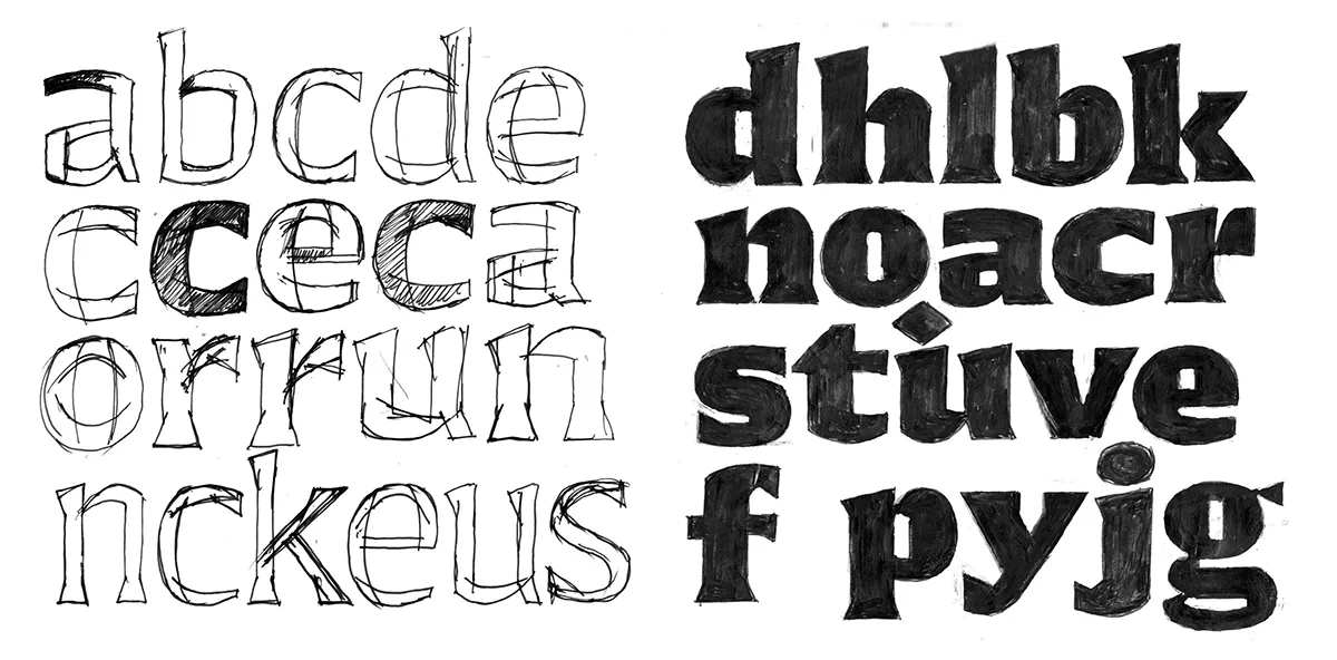
Early sketches and letterform explorations for the Arpona typeface by Felix Braden.
The creative process
3. Designing a typeface requires both creative freedom and extraordinary precision. How do you balance artistic expression with the technical demands of typography?
I think being a type designer requires a certain kind of personality – somewhere between an artist and a stamp collector. That’s actually how I see myself. I’ve always enjoyed drawing and felt the need to express myself creatively and artistically. But I also have a very systematic side that likes to complete collections. Sometimes, finishing a typeface project requires a lot of persistence. The creative part at the beginning is relatively small; after that comes a whole lot of craftsmanship and hard work. And right at the very end comes the part every type designer hates: kerning.
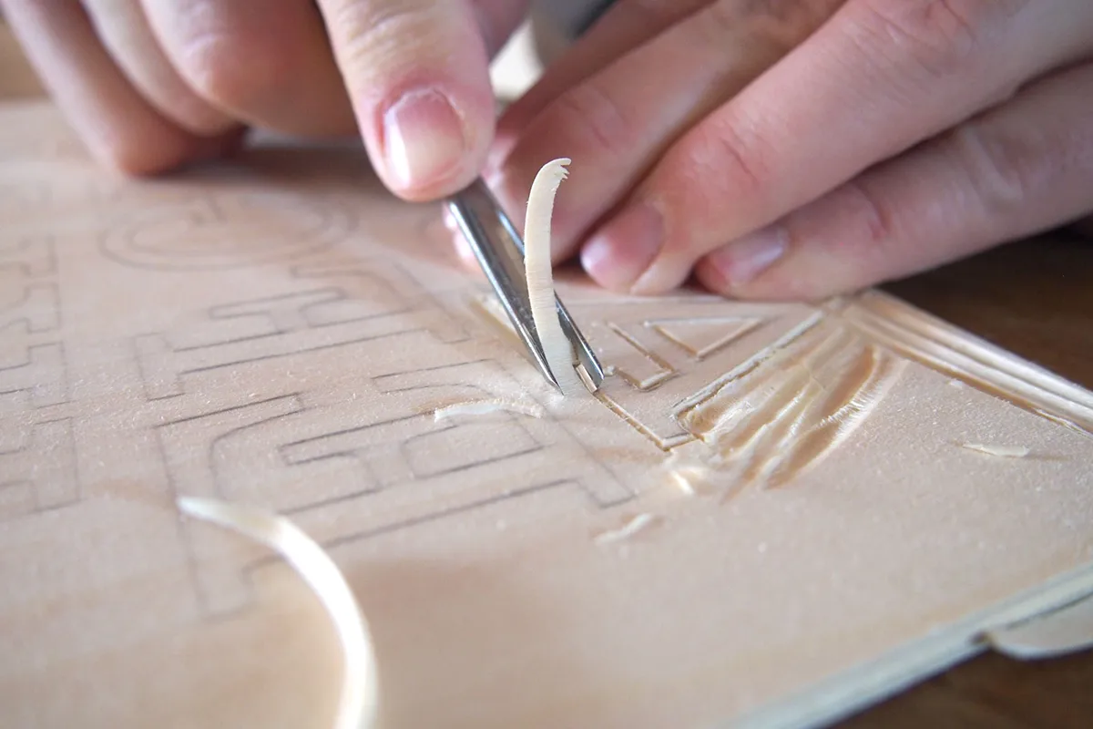
Hand-carving wooden letterforms during the development of the Kontiki typeface.
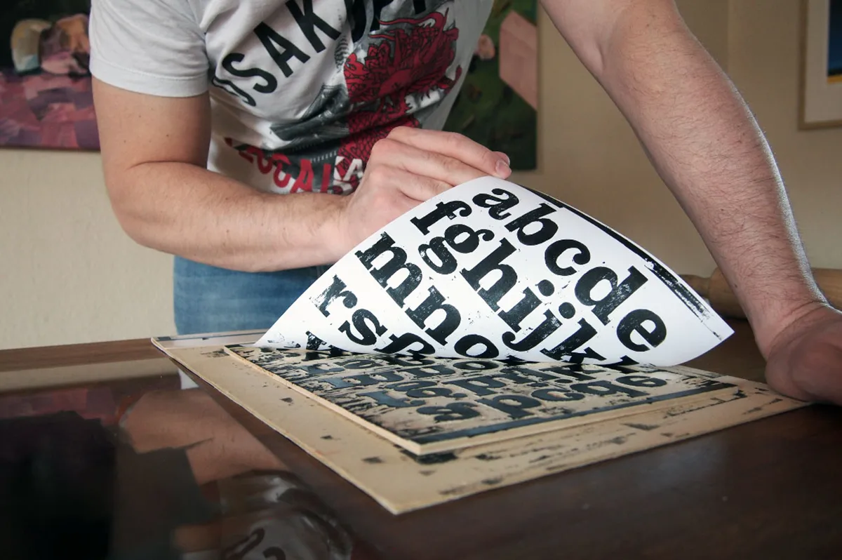
The hands-on printing process behind Kontiki, exploring the character of traditional woodcut lettering.
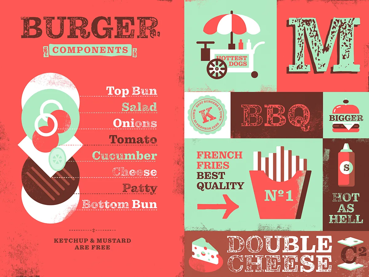
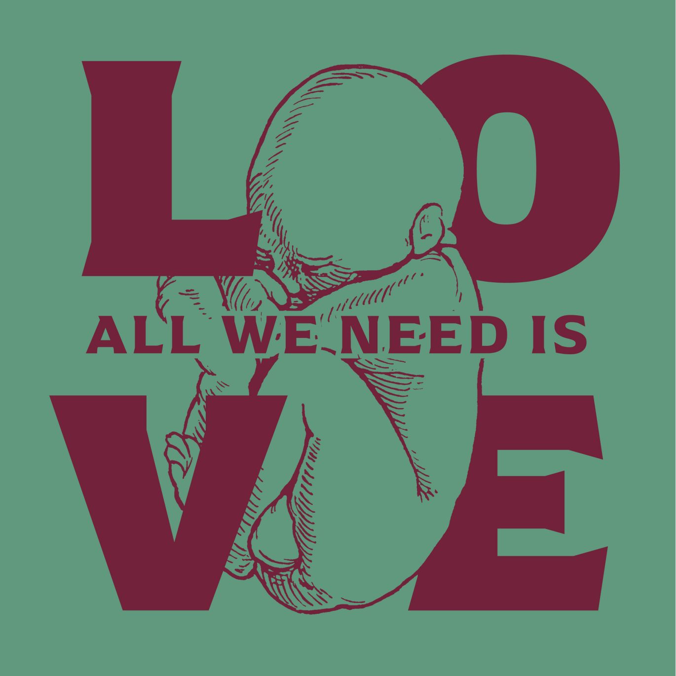
Kontiki typeface by Felix Braden / Floodfonts — a playful typographic composition inspired by vintage lettering.
4. What makes a typeface truly distinctive to you? In a world where thousands of fonts are available, what gives a new design its own voice?
I think that if you don’t build a typeface entirely on geometric principles, it automatically develops a voice of its own. As a designer, you invest so much time and care in a project that your own personality inevitably finds its way into the design, if you allow it to. Working with hand-drawn sketches helps me a lot because it makes the shapes feel more organic and alive. Of course, this doesn’t necessarily work if your starting point is to create your own version of an existing typeface. That’s why Helvetica differs so little from Akzidenz-Grotesk. But that approach can work, too. For example, I think Christian Schwartz’s redesign of Antique Olive, Duplicate Sans, is absolutely brilliant and has a very distinct identity of its own.
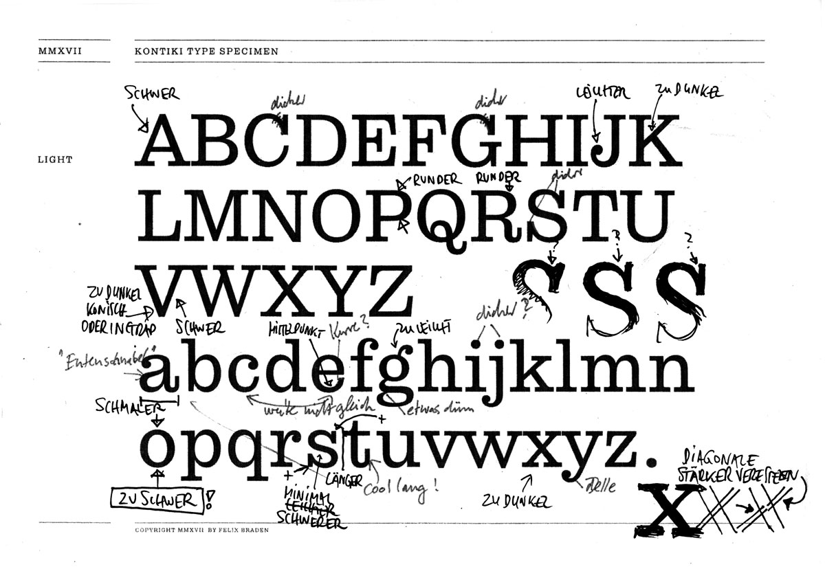
A correction sheet from the development of Pulpo, revealing the refinement and attention to detail behind type design.
5. Is there a particular letter or character you enjoy designing most — or one that consistently gives you trouble?
The lowercase a is a letter I particularly enjoy designing because it’s so important to the overall character of a typeface. For one thing, it appears so frequently in text that it plays a very significant role. For another, it contains many different elements that also appear in other letters of the alphabet: a ball terminal, a stem, a shoulder, a curved stroke, and a tail or a serif. You could say that the lowercase a alone contains almost the entire DNA of a typeface. At the same time, its overall shape is less strictly defined than that of many other letters, leaving more room for individual interpretation. It’s also a letter that almost always causes trouble. With Corsario, I spent ages trying to find the right shape for the ball terminal of the a, making countless sketches along the way.
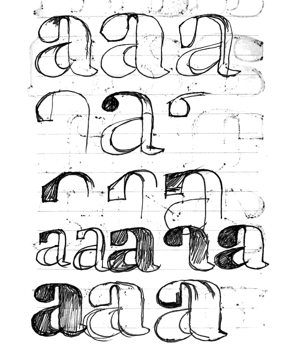
Exploring the shape of the lowercase ‘a’ during the development of Corsario.
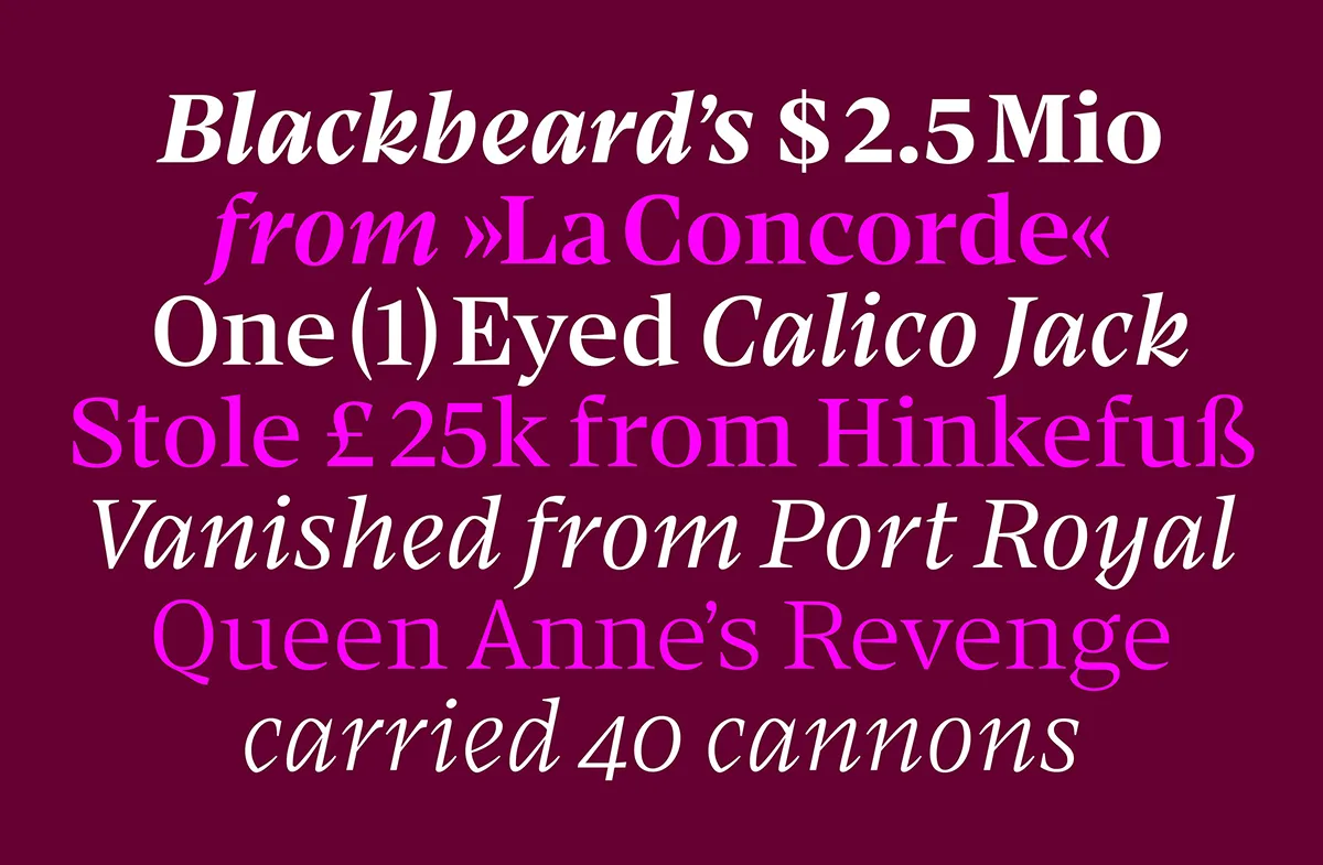
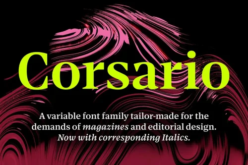
Corsario by Felix Braden / Floodfonts, combining expressive letterforms with editorial elegance.
6. Have you ever started designing a typeface with one idea in mind, only to discover that it wanted to become something completely different?
Yes, that definitely happens. With Turbine, I initially wanted to use an axis for an unusual purpose – something other than weight or width, for example. I decided to create an axis that would control the shape of the rounded forms, allowing users to choose between different curve shapes ranging from a circle to a square. In the end, however, I discovered that one particular shape, somewhere between the extremes and close to a superellipse, actually looked better than all the others. So I decided to abandon the variability and offer the typeface in that single shape instead.
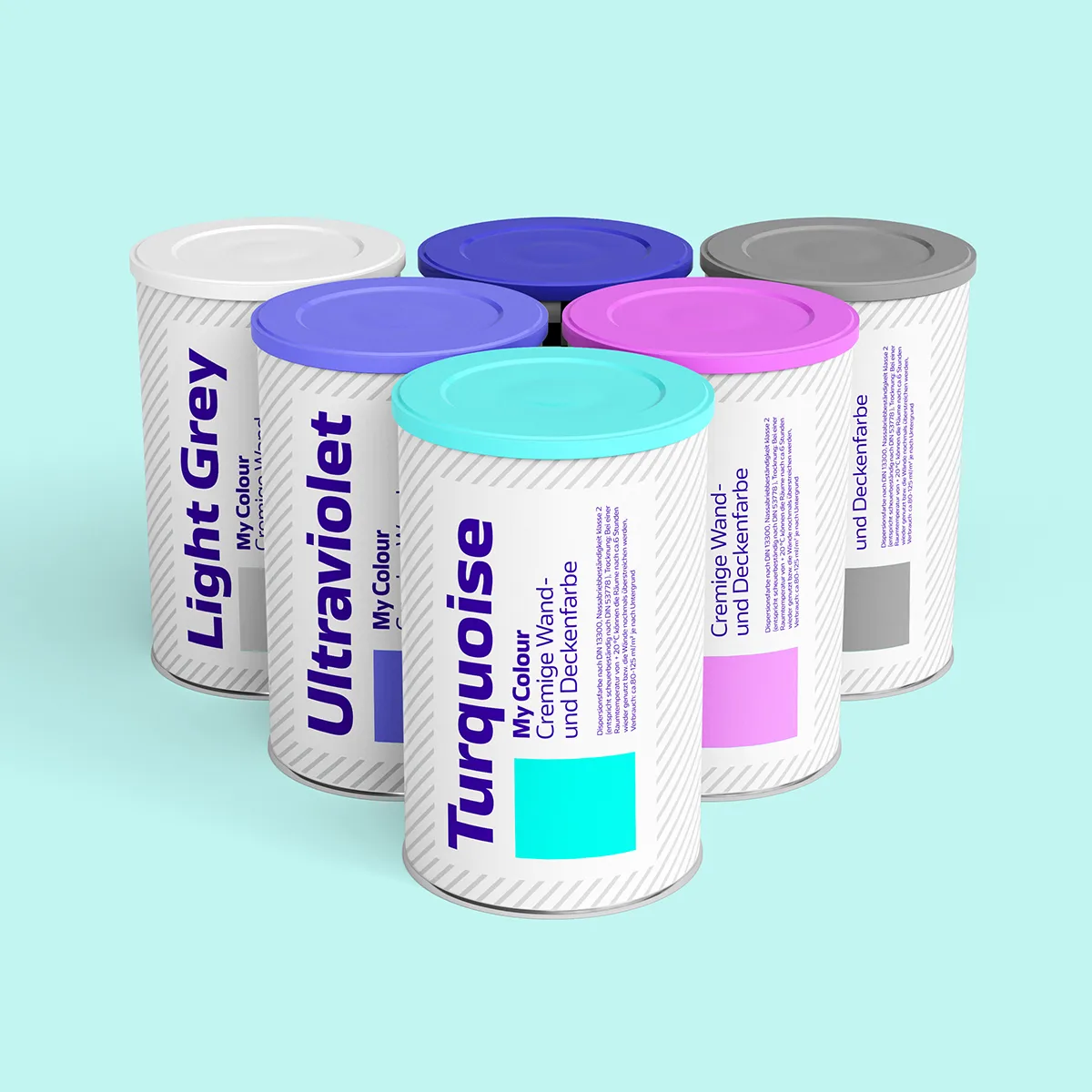
Turbine typeface in a colorful packaging application, demonstrating its versatility in contemporary design.
Typography in the real world
7. Your typefaces have appeared in everything from editorial design to international packaging and brand identities. What is it like to see your work take on a life of its own in the hands of other designers?
That’s the best thing about being a type designer: unexpectedly discovering your typeface out in the wild. It happened recently while watching the latest Wallace & Gromit film. When the sinister little penguin programmed the garden gnome robot’s personality to “EVIL”, the word suddenly appeared set in my typeface Ferryman. I was so excited that I jumped off the sofa and pointed at the screen with my mouth wide open. I love Aardman, so something like that makes it even more special. But even when someone simply creates a beautiful design using one of your typefaces, it’s a wonderful feeling.
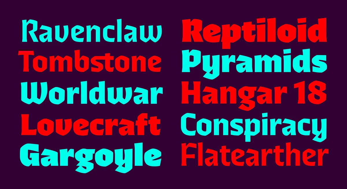
Ferryman typeface by Felix Braden / Floodfonts, featuring bold and distinctive letterforms.
8. Readability and personality can sometimes seem like competing priorities. How do you decide how much character a typeface can have without compromising its usability?
Of course, you can see them as opposites, but for me, that’s exactly the tension I enjoy exploring when designing typefaces. Finding the right balance is something I find incredibly inspiring. How far can I push the design without compromising readability too much? That’s precisely what interests me about type design. I enjoy designing typefaces that work well for branding, where recognition is extremely important, but so is readability. I don’t think there’s any magic formula for achieving this. You simply have to experiment and test. Often, good readability depends on just a single letter that is particularly important to the overall design, such as the a or the e.
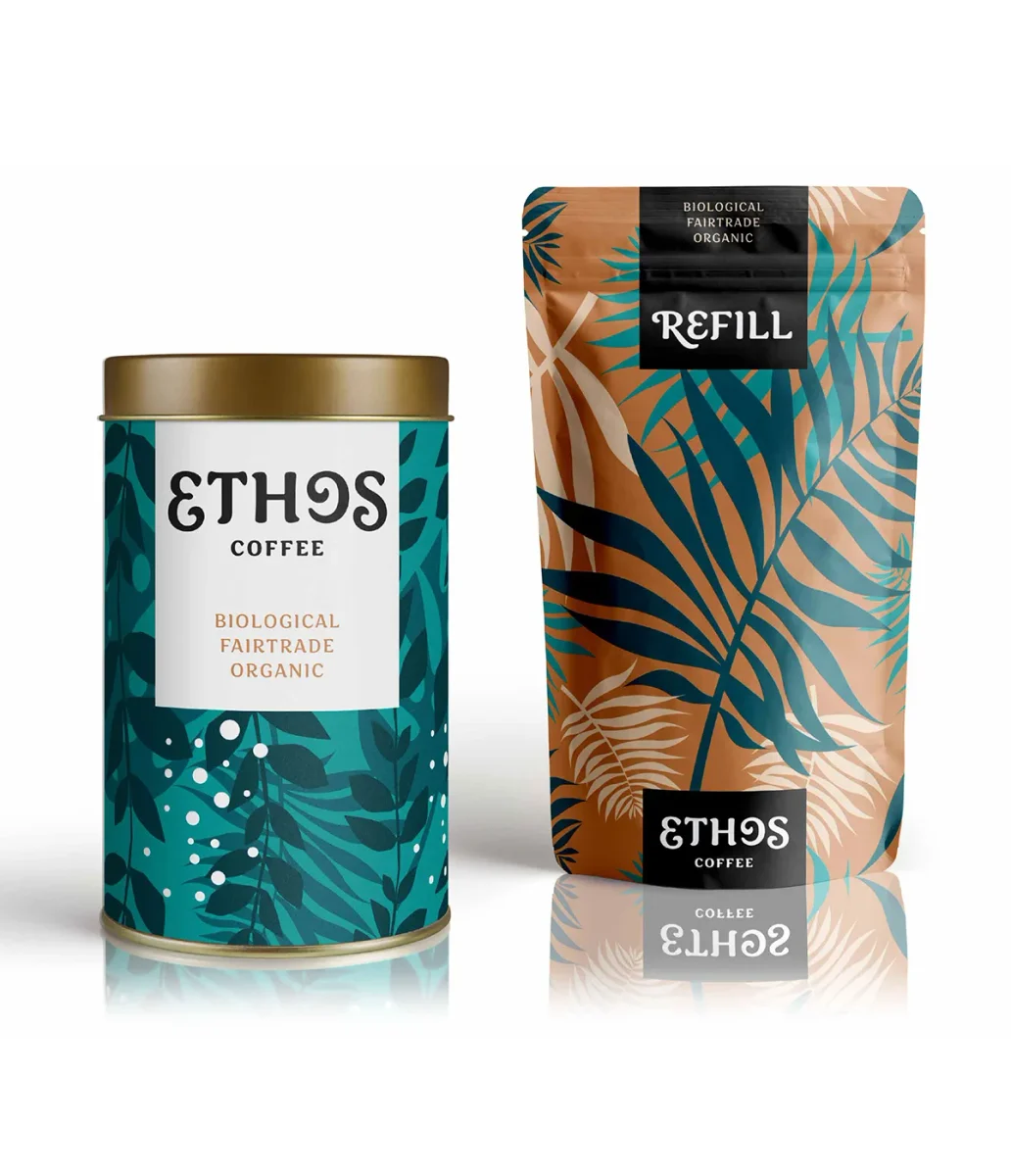
Sirenia typeface in coffee packaging design, featuring decorative patterns by © Pia Kolle.
Influences and the future
9. Water seems to be a recurring theme throughout Floodfonts, from its name to typefaces such as Tuna, Scuba and Pulpo. Where did this fascination begin, and does it extend beyond naming into your creative thinking?
I really do find water fascinating in so many ways – as a habitat for countless animals and plants, as an element that forms the basis of all life, as a source of energy, or as a symbol of the unknown and an inspiration for fantastic stories. Over the years, this theme has provided me with a perfect framework for presenting and marketing all my typefaces, and I don’t feel that I’ve exhausted it yet. I think the way a typeface is presented is very important for its acceptance by users. Looking at specimens and reading about typefaces should be enjoyable. That’s the only way a typeface will stick in people’s minds, so they can remember it when they need something similar at some point in the future.
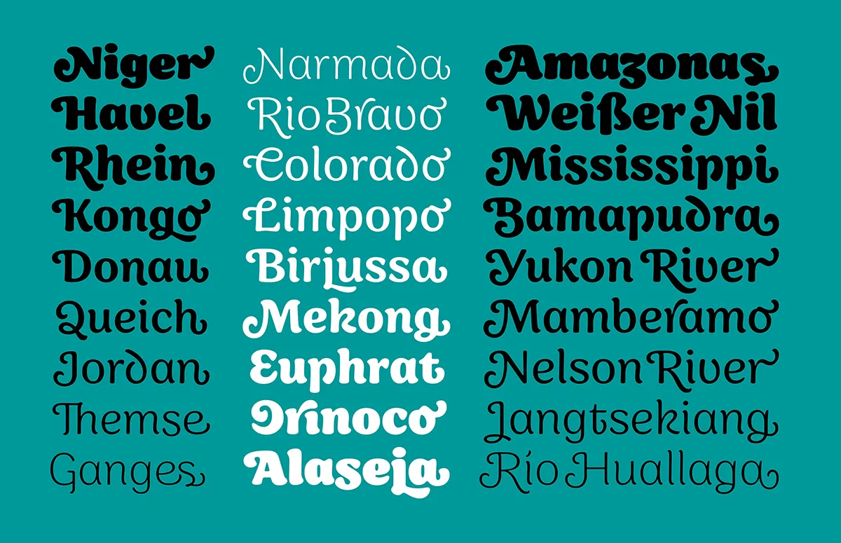
Alternative characters and expressive letterforms from the Sirenia typeface family.
10. Looking at the rapid development of AI and automated design tools, what aspects of type design do you believe will remain fundamentally human?
To be honest, I have no idea. I can certainly imagine that, in a few years, we might no longer use fonts at all, with text being entirely generated and typeset by AI as part of the design process. Throughout the history of design, we’ve seen the easier and cheaper option win out over something better and more meaningful far too often. On the other hand, my experience has been that finding the right typeface for a project requires a complex process of consultation and coordination between many different people, and I don’t think anyone could capture all of that in a single prompt. So I can also imagine that almost everything will stay the same and AI will simply be used as a tool to make tedious, time-consuming tasks easier. That’s what I would hope for. There are already far too many cheap, poorly made remakes of existing typefaces out there. I’m afraid AI will only accelerate this trend, producing endless variations of things that already exist rather than truly original work.
© Google Deep Mind / Pexels download
11. What do you think young graphic designers often misunderstand about type design, and what would you encourage them to explore before attempting their first typeface?
I think many young designers are put off by what they perceive to be the enormous amount of work involved in designing a typeface. I don’t think that’s justified. Your first typeface doesn’t have to be perfect or include an extensive character set. My advice would simply be to get started and give it a go. You can learn a great deal on your own, and the Glyphs website alone offers so many tutorials that you hardly need any formal introduction (https://glyphsapp.com/learn). On top of that, the type design community is very open and helpful.
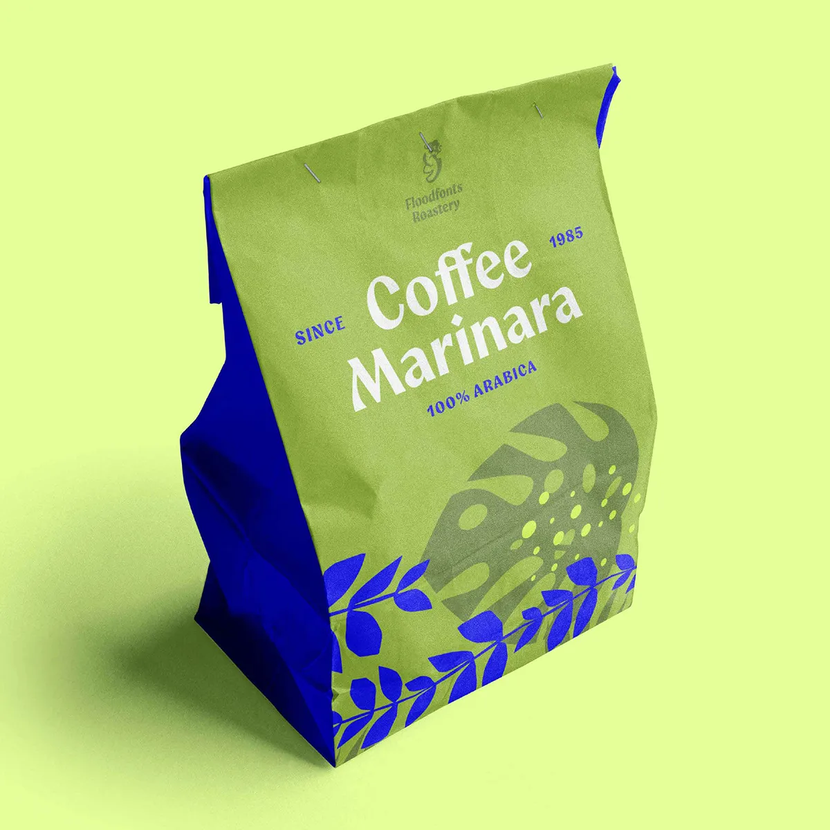
Aquavit typeface by Felix Braden / Floodfonts, featured in a contemporary coffee packaging design. Ornament © Pia Kolle.
12. After so many years of creating typefaces, what still excites you about typography? Is there a particular direction or experiment you haven’t explored yet but would love to pursue?
I still enjoy beautiful letterforms as much as ever – perhaps even more than I used to. When I look at something like Roslindale by David Jonathan Ross, for example, I see so much beauty in every single letter. And that’s despite the fact that an alphabet actually offers so little room for creative expression. Seeing work like that really motivates and inspires me. I’ve never really had the problem of not knowing which typeface to design next. I usually know what I want to work on before I’ve even finished my current project. I’m simply not a particularly fast type designer :-). There are still a few things I’d definitely like to do: a connected script typeface, a stencil, a brush typeface, and a classic book typeface (a Garalde).
Explore more of Felix Braden’s work at Floodfonts
Interview by Graphic Art News.
Typeface designs and project imagery courtesy of Felix Braden / Floodfonts. Portrait photography © Norman Posselt. Sirenia patterns and Aquavit ornament © Pia Kolle.