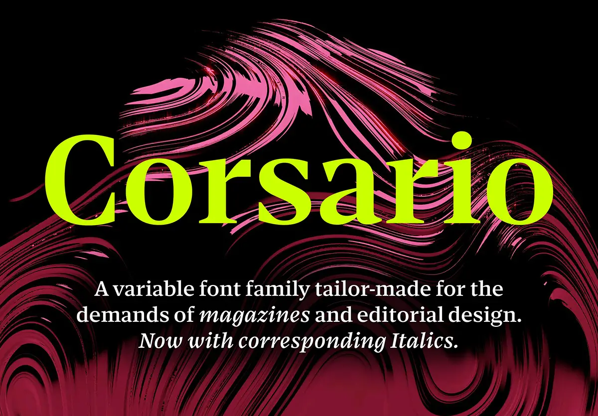
Editorial design demands a great deal from a typeface. It must perform across different sizes and applications – from expressive headlines and long-form reading texts to captions and footnotes – while preserving a cohesive visual identity. Designed by Felix Braden, Corsario Variable was created to meet precisely these challenges.
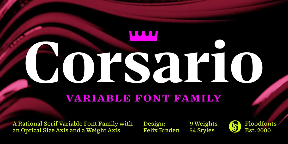
Combining a weight axis with an optical size axis, the variable font gives designers greater control over typography in different reading environments, moving beyond the limitations of predefined styles. A single font file can therefore accommodate everything from expressive display typography to continuous text and even the smallest typographic details.
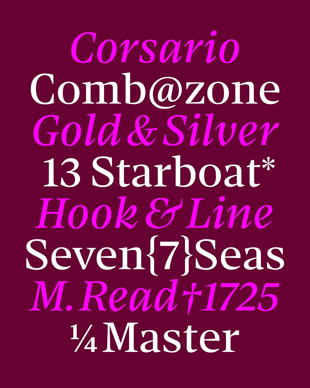
Inspired by the British typographic tradition of the nineteenth century, Corsario draws selectively from Transitional, Scotch and Fatface designs of the period, bringing together their structural characteristics with contemporary proportions and geometric details. Its distinctive, sharply defined serifs give the typeface a recognisable personality and an elegant presence at larger sizes, while supporting stability and legibility in smaller text.
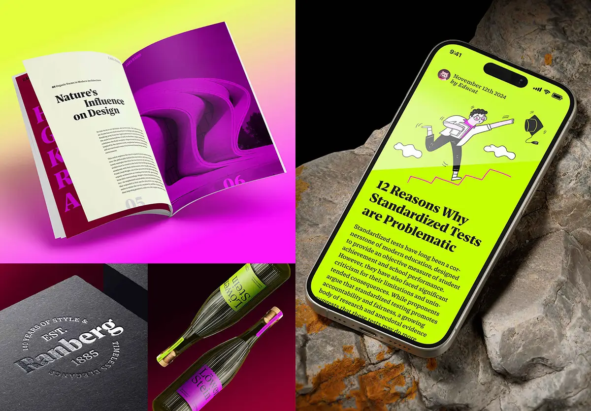
Designing for Legibility
The work of Dutch type designer Gerard Unger, particularly his research into legibility, played an important role in the development of Corsario. Unger frequently employed relatively flat, horizontal shoulders to open up counters and create a lighter typographic texture. A characteristic feature of this approach is the use of flatter arches, particularly in letters such as n, h and m, which emphasise horizontal structures and encourage a smoother reading rhythm.*
This horizontal emphasis becomes especially apparent in Corsario’s Caption version. Here, it produces a stable and highly legible texture, even in demanding reproduction conditions such as low-resolution screens or newspaper printing.
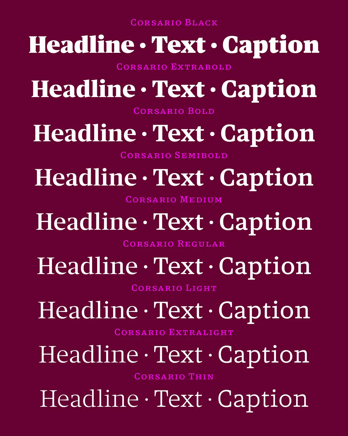
Other features of the type family reflect the same attention to functionality. In display sizes, the delicate hairlines gradually become heavier as they approach the serifs, reinforcing areas that contribute to character recognition. In text and caption sizes, these fine strokes are strengthened throughout to maintain clarity and readability.
Rethinking Optical Sizes
Corsario Variable also offers a contemporary interpretation of the traditional typographic concept of optical sizes. In the era of metal type, each point size was typically drawn individually. Smaller sizes called for sturdier proportions and simplified details, whereas larger sizes could accommodate finer contrasts and more delicate forms.
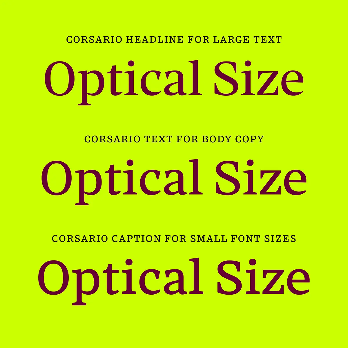
This approach gradually faded with the arrival of phototypesetting in the mid-twentieth century. Technical and economic considerations encouraged the use of a single design scaled to different sizes – a compromise that continued largely unchallenged into the desktop publishing era.
Variable font technology has renewed interest in optical sizing. By incorporating multiple optical sizes into a single font file, variable fonts allow designers to move smoothly between different typographic treatments. Corsario Variable embraces this technology, translating a traditional principle into a flexible digital system.
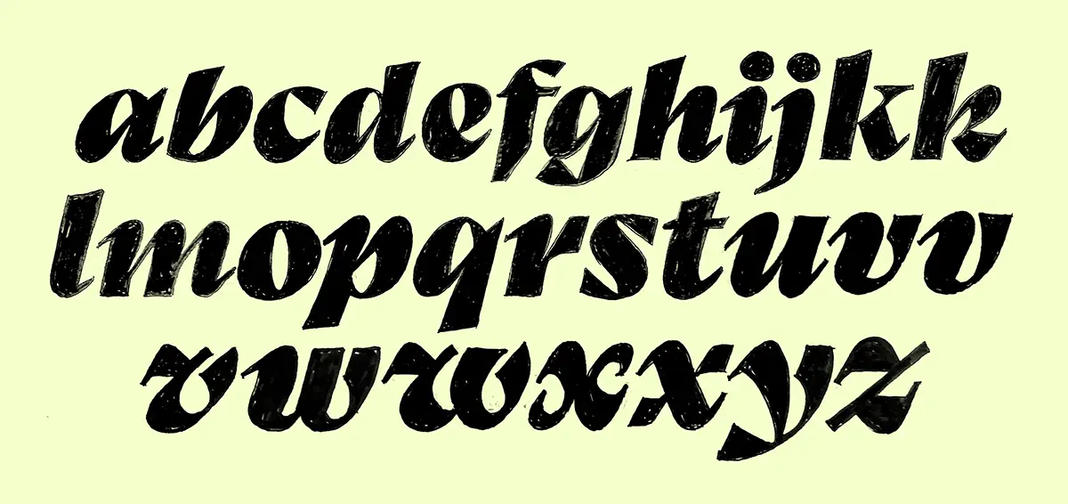
The result is a type family in which expressive display typography and highly legible text styles can work together, maintaining visual consistency across the diverse requirements of contemporary editorial design.
For editorial designers working across print and digital media, Corsario offers a compelling balance between typographic expression, readability and flexibility.
Unger, G., Wie man’s liest, p. 119, Zürich 2009

Hard Facts
Foundry: Floodfonts
Designer: Felix Braden
Release: September 14, 2026
Format: Variable Font
Styles: 2 Variable Fonts (Italic & Upright), resulting in 54 styles
Price: Family $792 | Free for all users of Adobe Creative Cloud
Microsite: https://floodfonts.com/corsario