Package design inspiration has began to rule the world of design. The more we search on the internet, the more amazing ideas we see. It’s as a new kind of art has started with aim not only to sell the product but to also improve the aesthetics of the world. Here I gathered 8 wonderful, some awarded packages that will impress you.
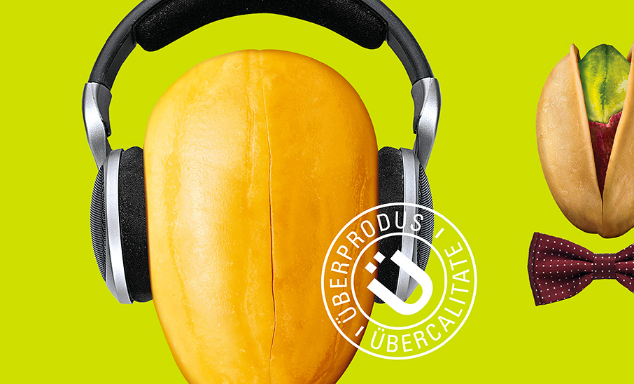
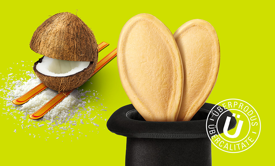
Übernuts
Pentawards, the most important international competition exclusively dedicated to packaging design, awarded Brandient with the Silver prize in the Food category at its 2014 edition, for the Übernuts packaging design.
A leading player on the pasta & snacks market in Romania decided to enter the packaged nuts & seeds category and needed a new brand for that purpose. The shelf is crowded and lacking differentiation, and packaging is predominantly playing at a functional level—therefore a strategy was devised to create a brand full of verve, with strong personality, cool attitude and good-natured humour, sustained by a bold name and visual manifestation.
The name Übernuts is using the German ‘über’—which permeated both English and Romanian vernacular as a cool word for “over, super”—to position the brand as a self proclaimed quality standout, but in a light hearted way. The multiple meanings of ‘nuts’ add to the mojo of the brand, aimed primarily at the young demographic.

Product Identity
The unconventional name prompted a logo designed with a custom hand-drawn typography—at the same time naive and eccentric—which inspired a temperamental visual platform.
The package design is poking ‘Pop Culture’ fun at a celebrity-obsessed world, where even the smallest grain in the crowd would dream to become a celebrity, be that a rock musician, a football player, an illusionist, etc.
The vivid neon color is a strong brand property, clearly standing out on the shelf, triggering curiosity and trial and consequently building brand awareness with less effort.


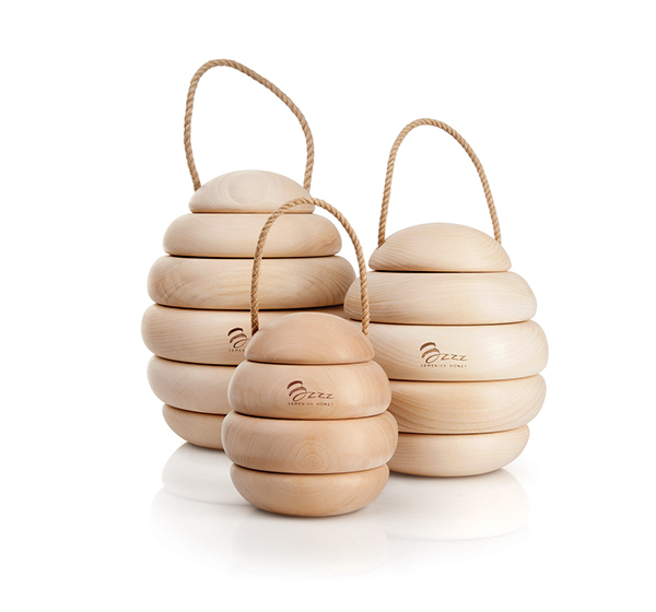
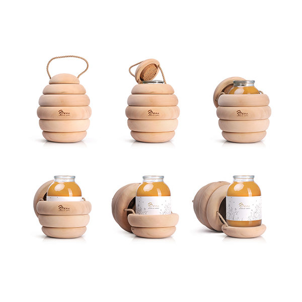
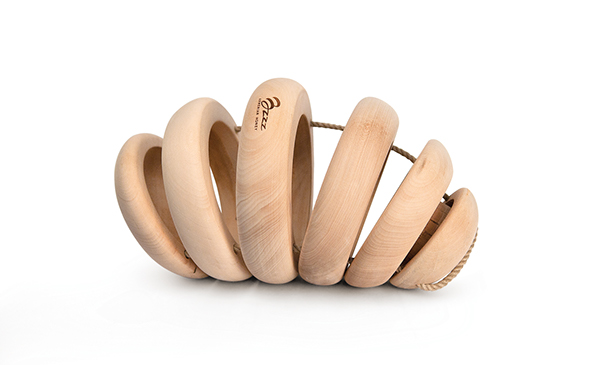
Bzzz Premium honey
Designed by Backbone Branding. Art Direction by Stepan Azaryan
The Challenge
Local honey manufacturer set the assignment of developing a name, logo and packaging for a quality natural honey. After the development of hexagon-shaped cupboard packages, we were given a new task: wrap the limited edition of honey jars as if they were a business gift.
The Solution
The initial sketches made by our art director during the briefing session with the client served as packaging concept for the product. Designed in a notion of biomimicry, the wooden hive left no room for alternative concepts and made the way to the technical execution. What any other container can pretend to enclose honey better than the hive itself?
As to the brand name and the logo, they were developed to resemble the natural buzz and bee waggle dance.
The Result
We are very proud with this project for many reasons. It was not only the fact that it garnered unprecedented number of respected awards in design and advertising industries but possibly more gratifying still has been great positive feedback from all over the world.
Awards: Pentaward, 2013 / The Dieline Package Design Awards, 2013, The 7th Intercontinental Advertising CU, 2013 / Brands of the World 2012 Logo Awards/ Golden Drum, 2012 / Golden Hammer, 2012 / Kiev International Advertising Festival, 2012 / Popok International Advertising Festival, 2012 / Red Apple International Advertising and Marketing Festival, 2012


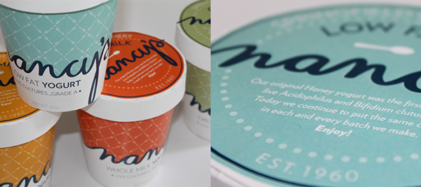
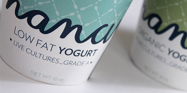
Nancy’s Yogurt
Designed by Amanda Day


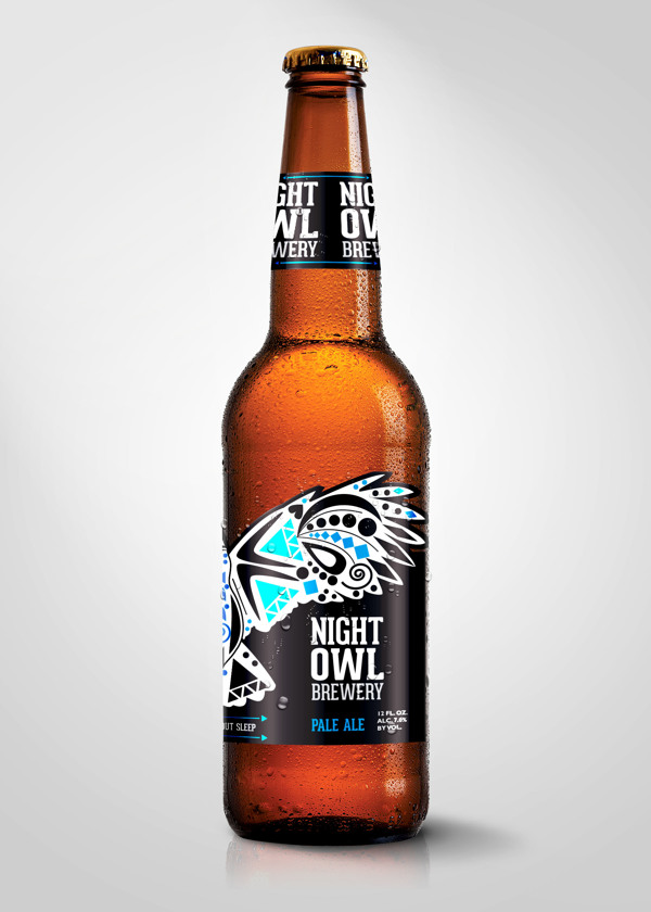
Night Owl Brewery
Designed by Missy Scharlow
Night Owl Brewery is a concept for a craft beer label. My inspiration was tribal inspired design and tattoo art. I wanted the customer to purchase this because they liked the look of the packaging. I wanted the consumer to have a 360 experience. I also wanted a unique diecut because it makes the owl actually have his wings spread and adds much more interest. A lot of times bottels are interesting in the front but the artist doesnt take in account all angles of the bottle. There would be other flavors of the brew and the blue would be replaced with other colors to help the customer identify flavors. The idea was to have a unique display for the bottles. I wanted it displayed were the owl had its wings spread out throughout the bottles My target audience is the night crowd who is interested in trying new craft beers. My keywords were: fun, unique, tribal, tattoo, impact, 360. I hope you like the design. Let me know any honest feedback. Thanks for looking.


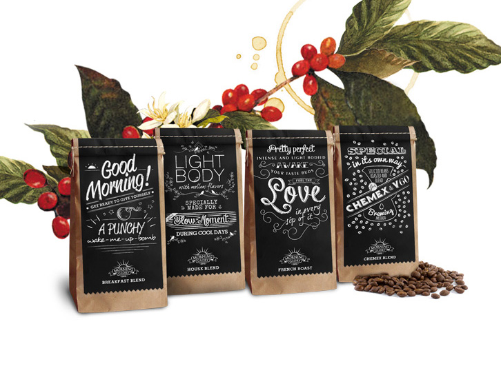
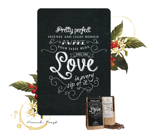
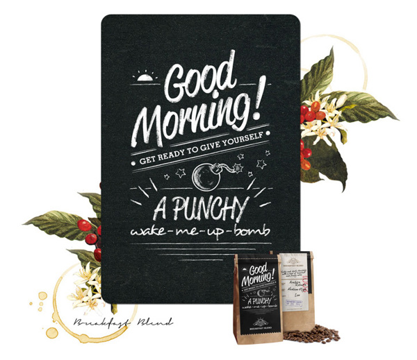
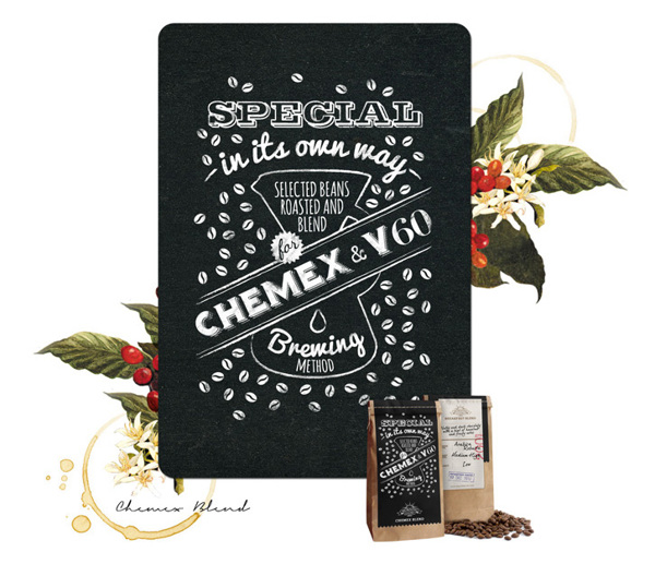
Morning Glory
Designed by Taffy Ariandi and Diasty Hardhikaputri
Morning is a period of time between midnight and afternoon, known as the perfect moment to enjoy a cup of coffee. This is the experience we would like to highlight, translate the term as a fresh start, and then accentuates into creative concept of Morning Glory Coffee packaging design.
The packaging are all designed in modern rustic look with application of chalkboard look typography. Beautifully unorganized layout gives playful mood but at the same time highlight the value of the special handcrafted coffee from Morning glory itself.

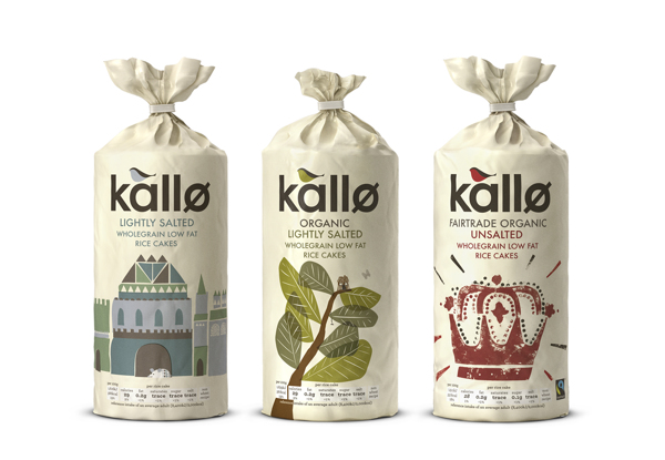
Kallo
Designed by Big Fish
Kallo make delicious, natural, healthy alternatives to things like cakes, biscuits, bread and even stock cubes. They just had one problem – their packaging was rather cold and lacked any emotion whatsoever and didn’t reflect their true identity.
We carried out some extensive research and discovered that Kallo consumers were intelligent people who like to be in control of what they eat. However, the old packaging made them feel like they were people who had “special needs” rather than foodies who are free to enjoy natural nibbles. So, we re-positioned the brand in order to liberate Kallo consumers from the taboo of being “functional foodies” and gave them something they could be proud of and love. How do you make people fall in love with a rice cake? You write poems, draw pictures and wrap it in love!


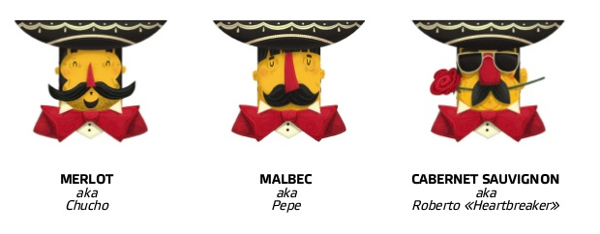
El Mariachi Red Wine Collection
Designed by IKON BC.
Creative and art director: Eugene Kuprienko Designers: Steve Simpson, Eugene Kuprienko, Anatoly Ivanov, Illustrator: Steve Simpson, Photography: Vasily Fetisov (FAME Studio), Project director: Dave Nichols, Papercraft keylines: Eugene Kuprienko


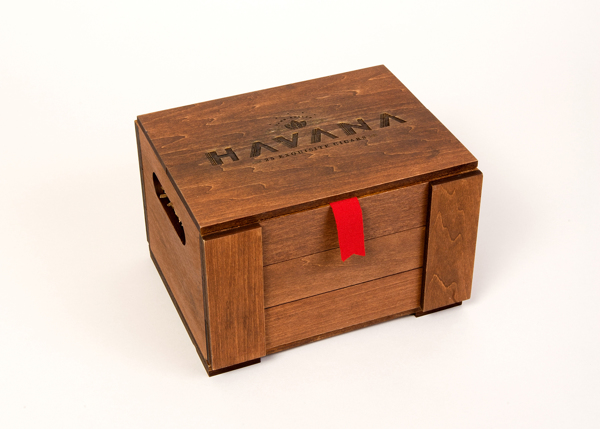
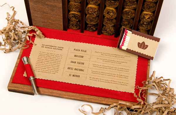
Havana Cigar Packaging
Designed by Max Amato, Art direction: Paul Sheriff
Identity design and packaging for a fictional cigar company, Havana. I was inspired by the fact that cigar exportation represents sharing a product, as well as sharing the culture of Cuba. The illustrated labels pay homage to Cuba’s art deco heritage through famous landmarks of its capital city.


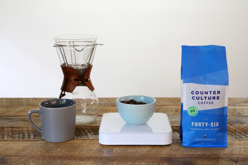
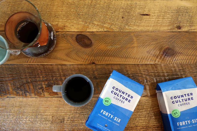
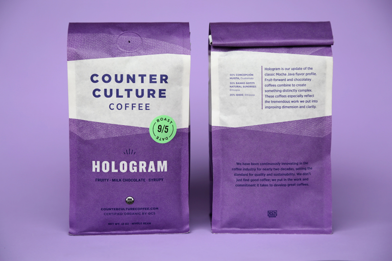
Counter Culture Coffee
Counter Culture Coffee is pleased to unveil a new look for its products, with bold, colorful designs and biodegradable packaging—along with new product names for four of its six year-round coffees. “Our goal was to better communicate the core values that have guided Counter Culture for almost 20 years, while presenting a more contemporary and cohesive look,” says Counter Culture President Brett Smith. “I am happy to say that the final product more than accomplishes this goal. The bright colors, updated names, prominent roast date, and transparent coffee information—all in more sustainable packaging—are a great combination of the old and the new.” The new package was conceived and developed by Counter Culture’s in-house design team.