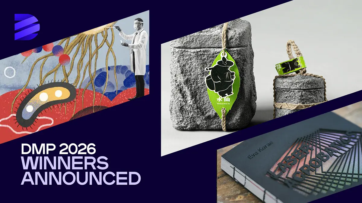
The Design MasterPrize (DMP) has announced the winners of its 2026 edition, celebrating outstanding creativity and innovation in design from around the world.
Now in its third year, the international competition recognizes excellence across Product Design and Graphic & Communication Design. An international jury of design professionals, including experts from Google, Amazon, Apple, and Meta, evaluated entries based on originality, craftsmanship, functionality, and societal impact.
This year’s winners span a wide range of disciplines, from consumer electronics, industrial design, and sustainable products to branding, packaging, exhibition design, typography, and editorial publications, reflecting the diversity and innovation of contemporary design.
Graphic Art News presents a curated selection of the 2026 Graphic & Communication Design winners, highlighting inspiring projects by established designers, creative studios, and emerging talents from around the world.
Explore the complete list of winners and Honorable Mentions in the official Design MasterPrize Winners Gallery.
PROFESSIONAL
Annual Reports
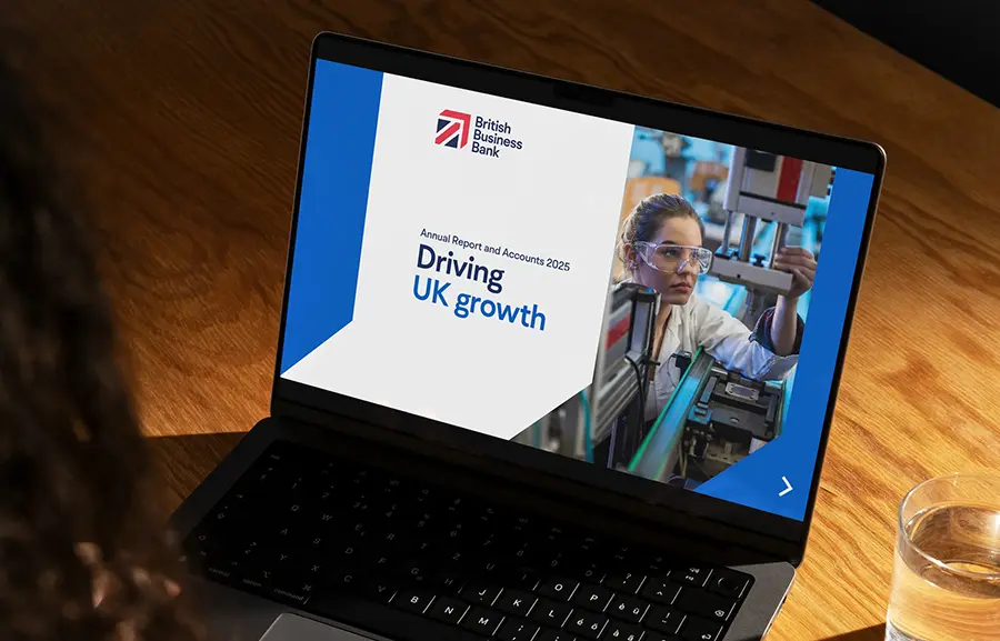
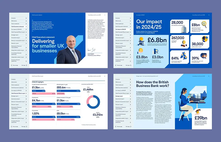
British Business Bank Annual Report and Accounts 2025
Firm Location: London, United Kingdom
Company: Red Stone
Lead Designer: Whole team
Design Team: Red Stone creative and project management teams
Client: British Business Bank
Project Video: https://youtu.be/OGDIDDYZ2UQ?si=opLbFlC6lPsY-Ukz
The British Business Bank’s 2025 Annual Report and Accounts marked its transition to a fully digital format, creating new opportunities for accessible and engaging visual communication.
The report introduced the latest evolution of the bank’s visual identity, incorporating a refreshed illustration style and digital-first design approach. The project extended beyond the report itself, supported by a specially produced film and a series of animated and static social media assets.
Branding and Corporate Identity
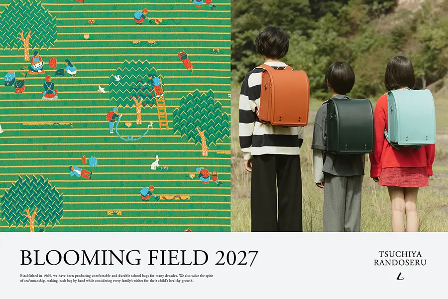
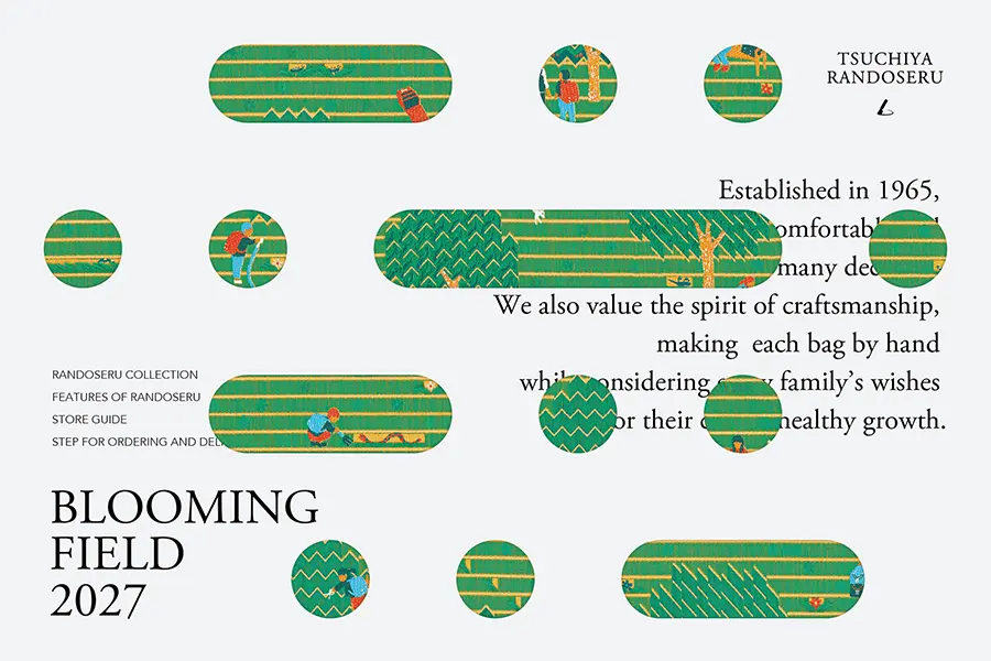
TSUCHIYA RANDOSERU 2027: Brand Campaign
Firm Location: Tokyo, Japan
Company: Tsuchiya Kaban
Lead Designer: Naoya Kon, Niko Goto
Design Team: Tsuchiya Kaban Creative Team
Project Video: https://www.instagram.com/reels/DUXF9swEso0/
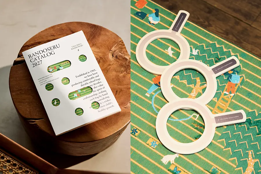
The TSUCHIYA RANDOSERU 2027 brand campaign celebrates over 60 years of craftsmanship and reimagines the traditional Japanese school bag through the theme “Blooming Field,” inspired by each child’s individuality and growth.
In collaboration with textile designer Yuri Himuro, the campaign features an innovative fabric whose pattern transforms when cut, reflecting childhood curiosity and discovery. The visual concept extends across digital platforms, catalogs, and retail spaces, creating a cohesive brand experience.
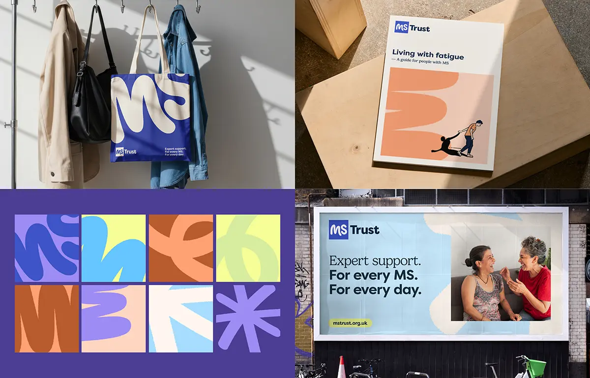
MS Trust brand identity

Firm Location: London, United Kingdom
Company: Red Stone
Lead Designer: Whole team
Design Team: Red Stone creative and project management teams
Client: MS Trust
Project Video: https://vimeo.com/1125838135
Red Stone developed a distinctive, digital-first visual identity for MS Trust, a UK charity supporting people living with multiple sclerosis. The rebrand aimed to strengthen recognition and differentiate the organisation from other MS charities.
Built around accessibility and audience research, the refreshed identity creates a clearer, more inclusive brand experience for people living with MS, healthcare professionals, and supporters, while supporting the charity’s long-term growth and engagement.
Scouts Explorers brand identity


Firm Location: London, United Kingdom
Company: Red Stone
Lead Designer: Whole team
Design Team: Red Stone creative and project management teams
Client: Scouts
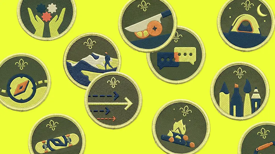
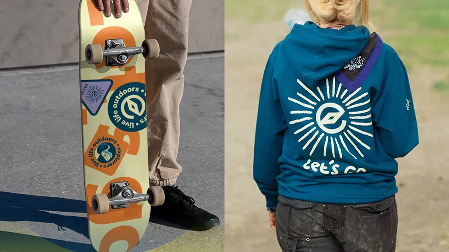
Explorer Scouts introduced a refreshed brand identity designed to connect with a new generation of teenagers. Built around the idea that the journey matters as much as the destination, the rebrand introduces the “Real Curious” concept, an authentic tone of voice, and a flexible visual identity.
The new approach celebrates individuality, inclusivity, and exploration, giving local Scout groups the tools to engage young people and foster a sense of belonging, confidence, and adventure.
Walk Wheel Cycle Trust brand identity

Firm Location: London, United Kingdom
Company: Red Stone
Lead Designer: Whole team
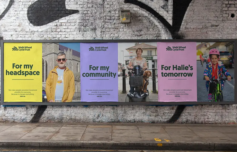
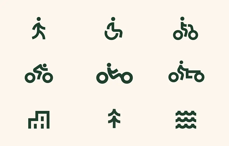
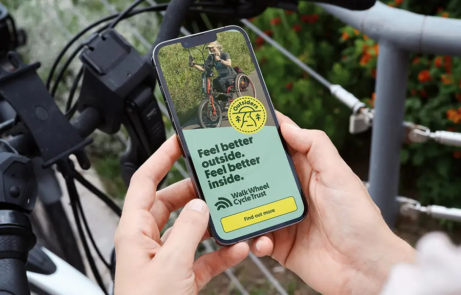
The rebrand of Walk Wheel Cycle Trust, formerly Sustrans, introduces a clearer name and a flexible visual identity designed to make walking, wheeling, and cycling more accessible and appealing.
Built around ripple effects and map-inspired graphics, the new identity highlights the impact of active travel on communities. The refreshed approach strengthens brand recognition, broadens audience engagement, and helps distinguish the organisation from the National Cycle Network.
Illustrations
Gaumen Hoch
Firm Location: Wien, 03. Bezirk, Landstraße, Austria
Company: Kokode
Lead Designer: Antonio Ortiz Ruiz
Design Team: Antonio Ortiz, Eva Mlinar
Client: Gaumen Hoch
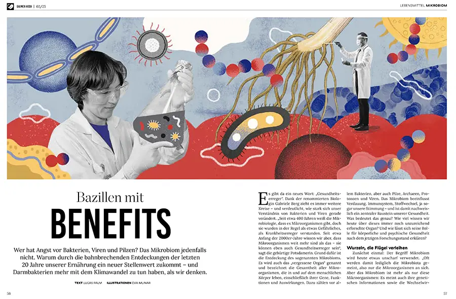
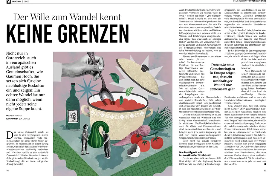
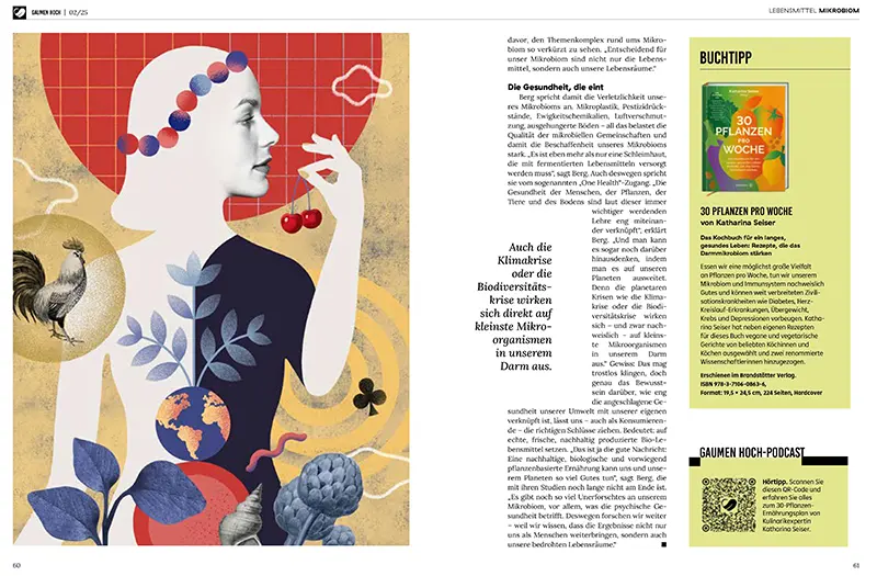
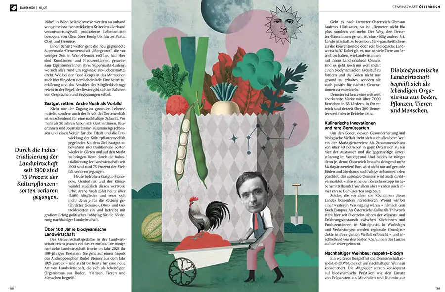
Gaumen Hoch is a magazine project exploring sustainable food practices and slow-food culture through editorial illustration. The illustrations accompany two stories: one highlighting community initiatives in sustainable vegetable farming and biodynamic wine production, and another examining the role of microbiomes in agriculture and food quality.
Through visual storytelling, the project connects environmental awareness, biodiversity, and the importance of healthy ecosystems in producing nutritious, sustainable food.
Packaging Design
Chopin Residue
Firm Location: Warszawa, Poland
Project location: Warsaw, Poland
Company: Crystal Lake Group Sp. z o.o.
Lead Designer: Mariusz Szypura
Client: Black Element Label
Project Video: https://vimeo.com/1193502045
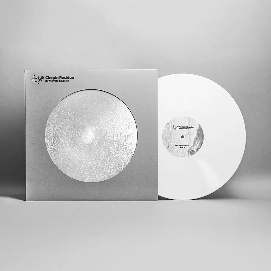
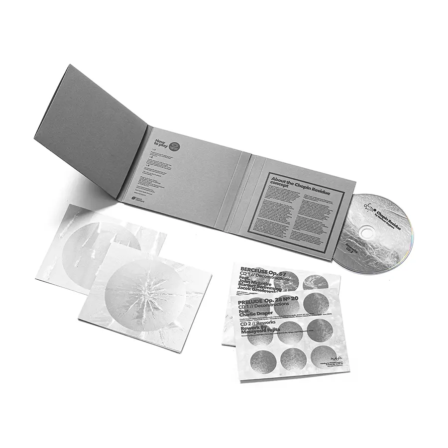
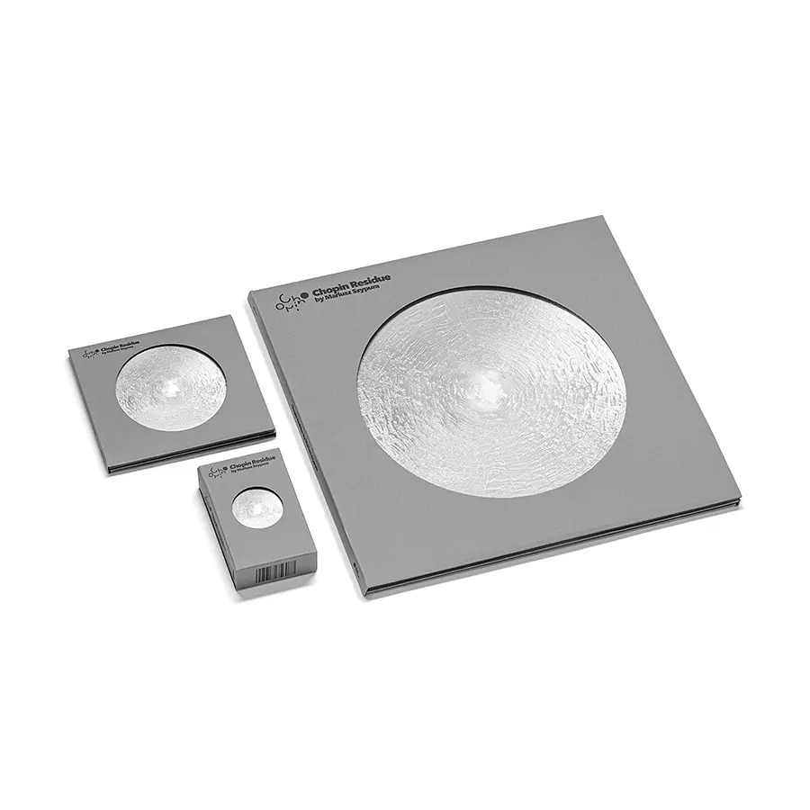
Chopin Residue is an experimental music and visual art project that explores what remains of Fryderyk Chopin’s compositions when the piano is removed.
The concept extends into the artwork itself: vinyl threads left behind during the record-cutting process were used to create Nonaptych, a series of nine large-scale paintings. Photographs of these works form the visual identity across the project’s editions, connecting sound, material experimentation, and graphic design through the idea of transforming what is left behind.
Posters
Nothing moves by itself.
Firm Location: Seoul, Korea, Republic of
Company: Mdash Creative Consultancy
Lead Designer: Minsu Kim
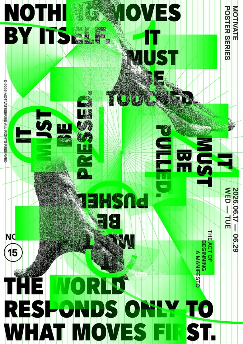
NOTHING MOVES BY ITSELF is a visual manifesto exploring the idea that every change begins with an action. Using a door handle as its central metaphor, the project illustrates how even the simplest movement requires someone to take the first step.
The concept extends to a runner at the starting line, connecting everyday gestures with determination and progress. Through the rhythmic repetition of words such as “PUSHED,” “TOUCHED,” “PRESSED,” and “PULLED,” the design reinforces the relationship between action, movement, and transformation.
Print & Books
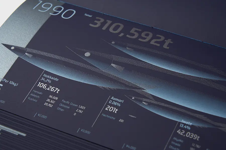
SANMA: Changes in catch and price since 1989 to 2024
Firm Location: Tokyo, Japan
Company: Kiyonori Matsumoto Graphic Design
Lead Designer: KIYONORI MATSUMOTO
Client: Own Work
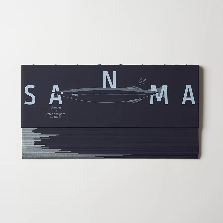
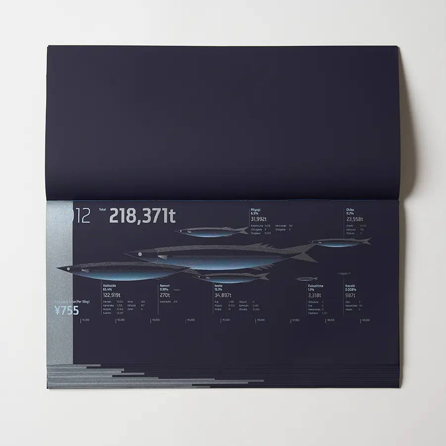
SANMA is an information design project exploring the changing catch volumes and rising prices of saury, a fish widely consumed in Japan, between 1989 and 2024.
Through detailed data visualisation, the publication presents national and port-level fishing statistics alongside price trends. Its distinctive production combines four-colour printing over white ink, a silver ink finish, and shifted codex binding, bringing together data-driven storytelling and experimental book design.
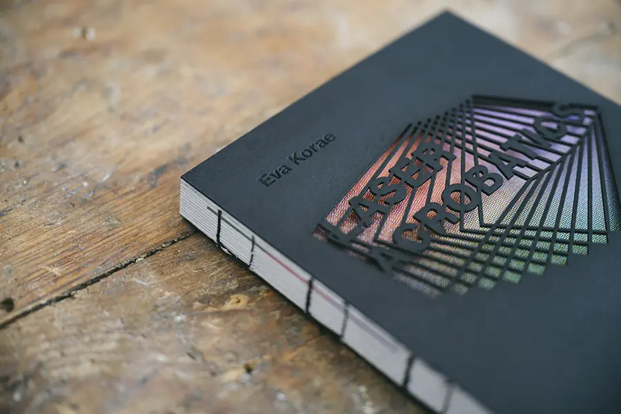
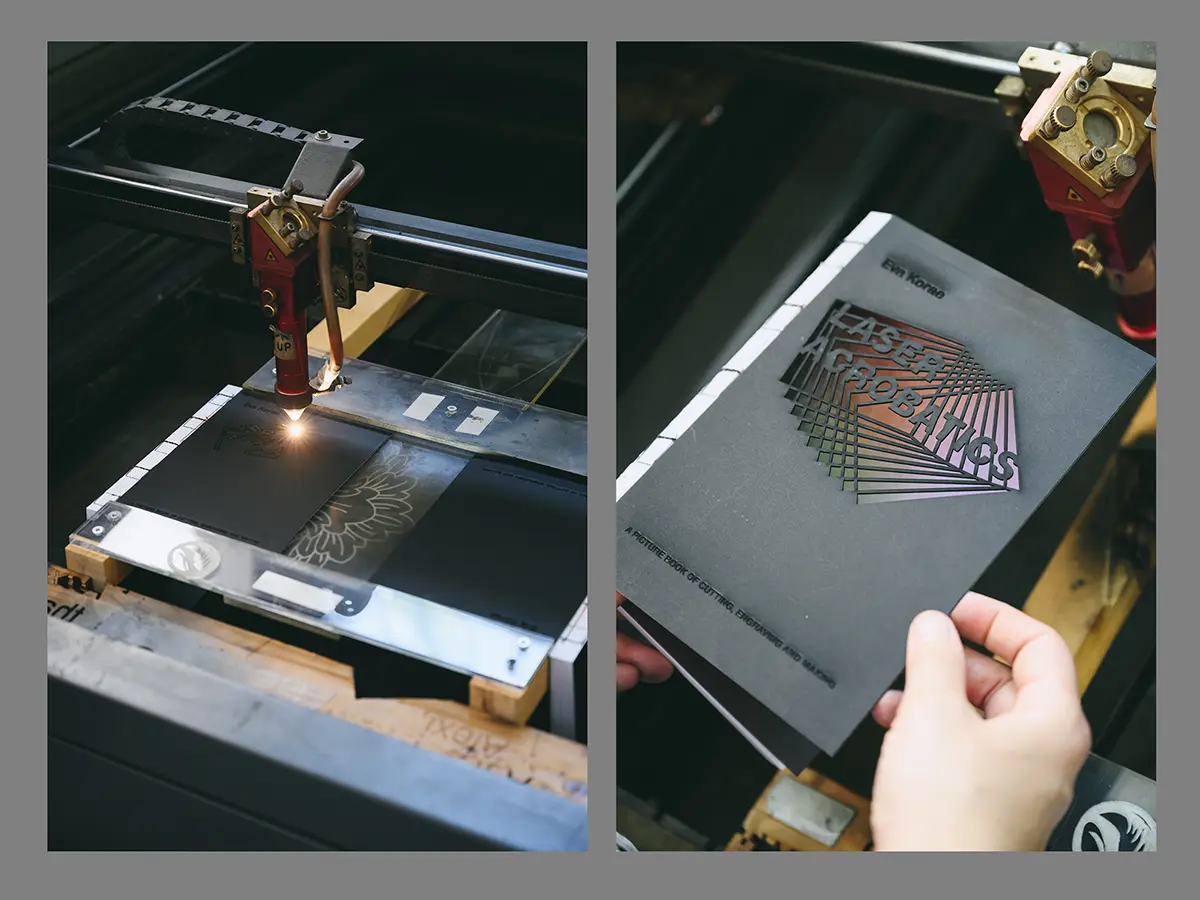
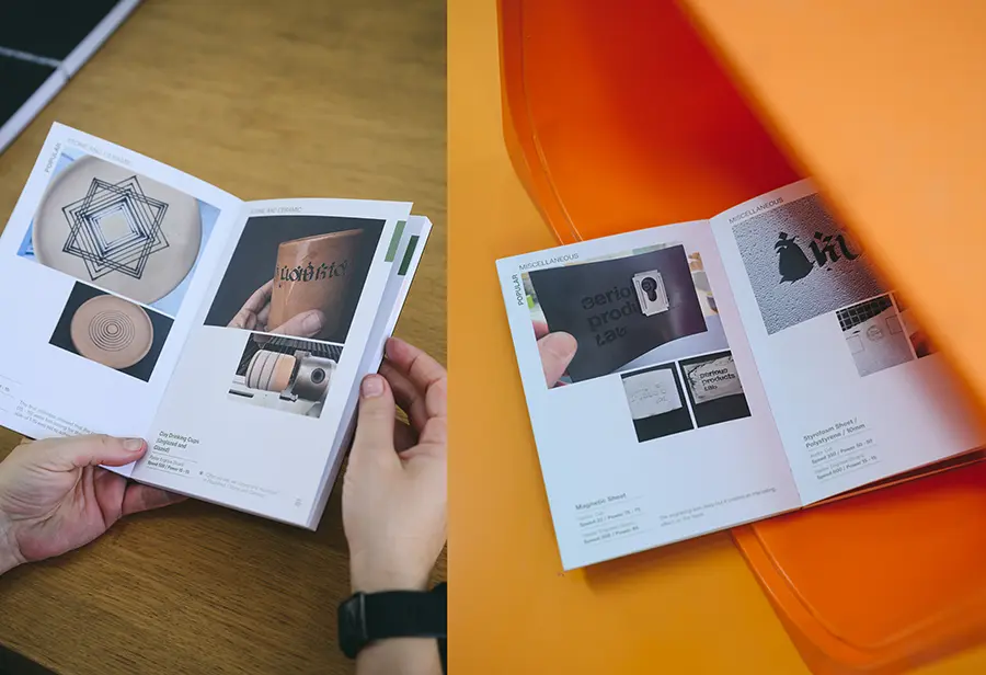
Laser Acrobatics, A Picture Book of Cutting, Engraving and Making
Firm Location: Limassol, Cyprus
Company: Cyprus University of Technology
Lead Designer: Popi Pissouriou and Eva Korae
Design Team: Marios Constantinides
Project Video: https://www.instagram.com/p/DRwbnIVjBFh/
Laser Acrobatics, A Picture Book of Cutting, Engraving and Making explores the creative possibilities of CO2 laser cutting through three years of experimental research.
Organised into three sections — Popular, Acrobatics, and Flourished — the publication moves from conventional cutting and engraving techniques to unconventional applications and experimental projects. Designed as a tactile object, the book celebrates the versatility of laser technology while documenting the maker’s hands-on creative process.
Dancing in Utopia
Firm Location: New York City, United States
Company: Studio Selina Kehuan Wu
Design Team: Selina Kehuan Wu
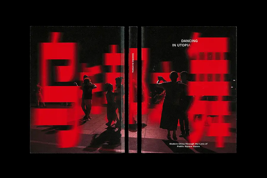
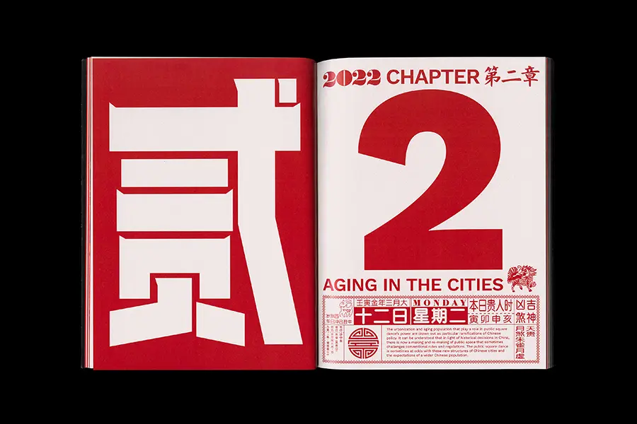
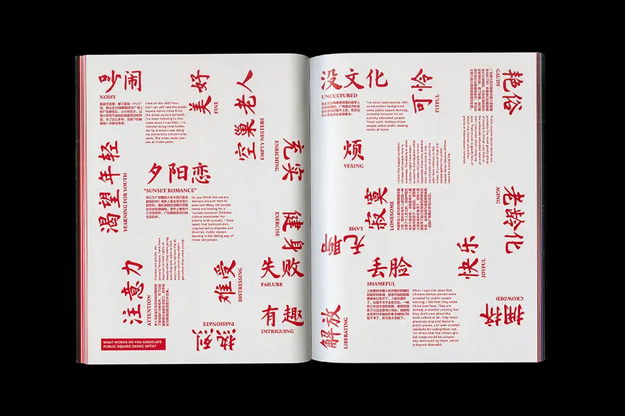
Dancing in Utopia is an editorial design and research project exploring public square dancing, a popular pastime among older generations in China, through interviews, surveys, and original photography.
Structured into four chapters inspired by the colours of sunset, the publication uses typography, visual rhythm, and book design to reflect the passage of time and the movement of dance. Drawing on traditional and contemporary Chinese culture, it examines broader themes of history, politics, gender, and ageing in modern Chinese society.
STUDENT
Illustrations
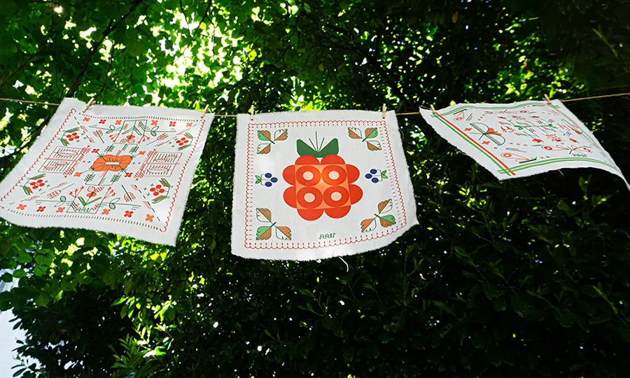
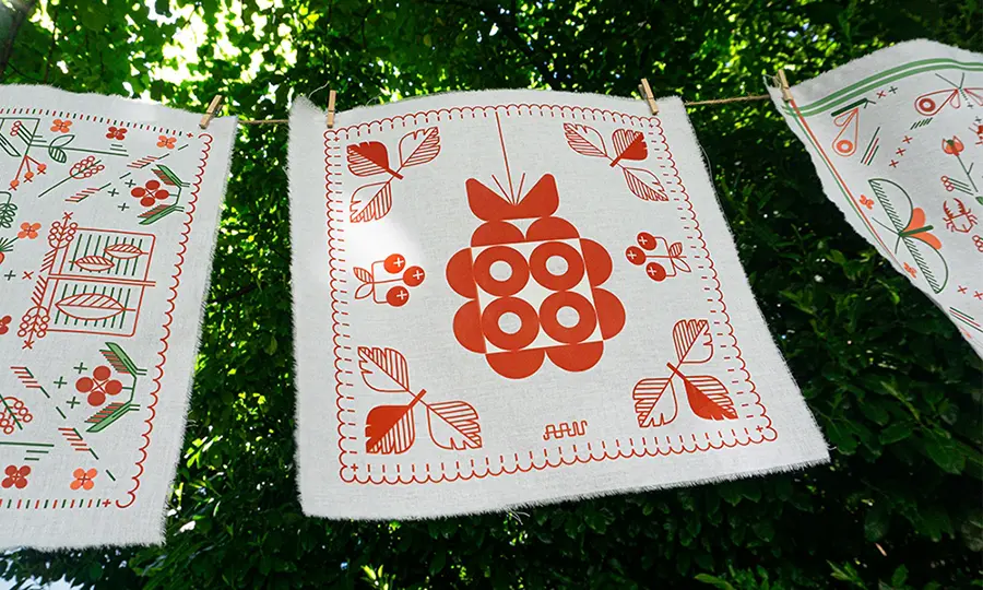
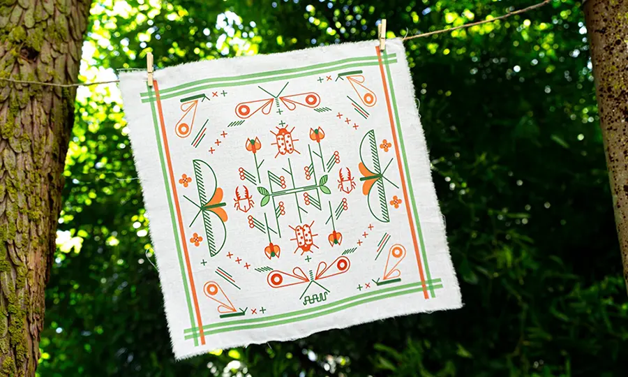
ZSEBIBE – An Illustrated Handkerchief Collection
University/School: Moholy-Nagy University of Art and Design
Lead Designer: Anita-Vivien Antal
Design Team Consultant: László Herbszt
Project Video: https://drive.google.com/file/d/1QnshS8qtGDIcsfSWaBIhOwMbGNoVzcbw/view?usp=sharing
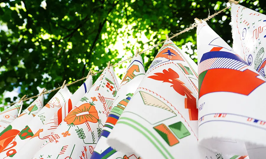
ZSEBIBE is an illustrated handkerchief collection exploring the emotional and cultural significance of collecting and preserving memories.
Through digitally created patterns inspired by personal and collective experiences, the project transforms the traditional handkerchief into a storytelling medium. Once used as an accessory, gift, or keepsake, it becomes a symbolic object that carries memories, emotions, and personal histories.
Packaging Design
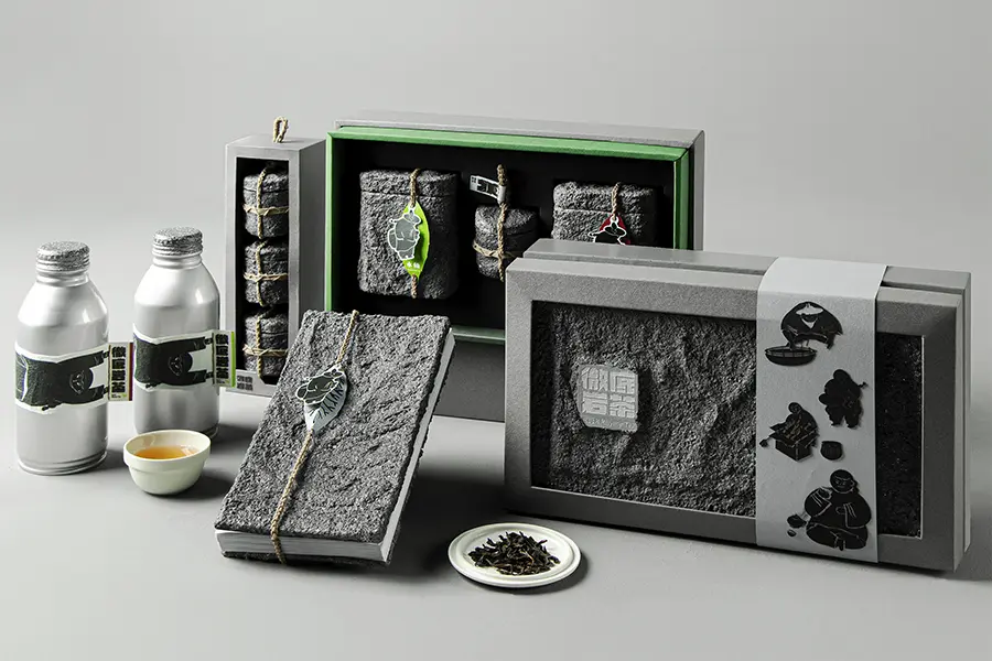
Rock Rhyme Tea
University/School: Ming Chi University of Technology
Lead Designer: Yu Hsin Tseng
Design Team: Yu Hsin Tseng, Yung Chia Wang, Chih Shan Huang, Esther Leau, Ling An Huang
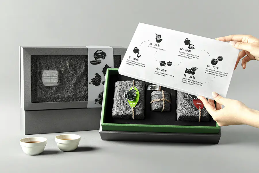
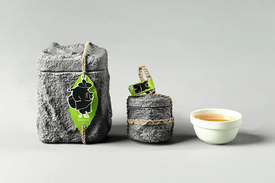
Rock Rhyme Tea is a packaging design project that reinterprets traditional Chinese Wuyi Rock Tea for a younger audience. Inspired by the tea’s origins in rocky mountain landscapes, the packaging incorporates textures that evoke the natural environment in which it grows.
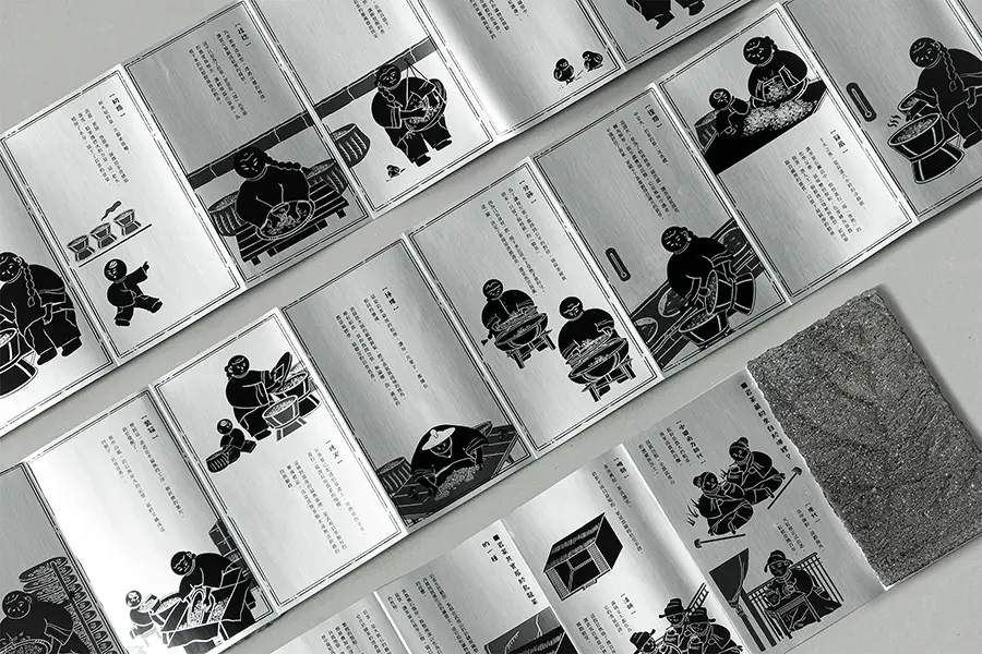
Designed to connect tea heritage with Generation Z, the visual identity extends across gift boxes, tea canisters, ready-to-drink bottles, and an illustrated booklet exploring the tea’s history and production. The project combines cultural storytelling with contemporary packaging design.
Expelling Unwanted Guests
Project location: Muzha Zhongshun Temple, No. 13, Zhonglun Rd., Wenshan Dist., Taipei City 116, Taiwan (R.O.C.)
University/School: Ming Chi University of Technology
Lead Designer: ChinChien Lin
Design Team: EnTong Li、SsuYu Lin、ChingHui Liao
Client: N/A
Project Video: https://youtu.be/6c9zlL7ncxY?si=6EeTKSyDQ5ATQvIy
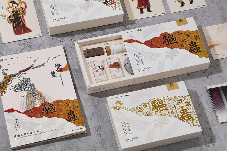
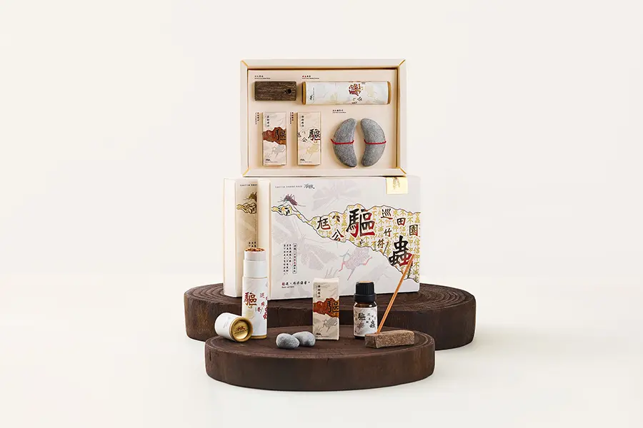
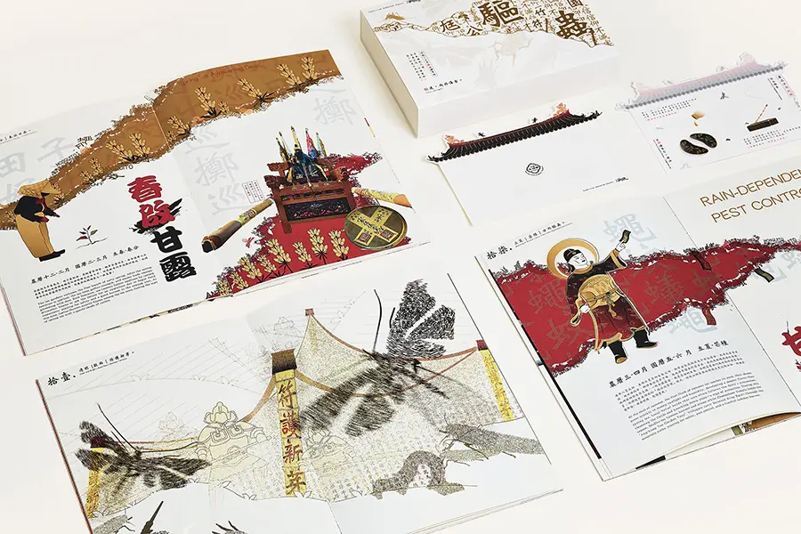
This project explores the cultural heritage of Muzha Zhongshun Temple and the traditional tea-farming community of Maokong, Taiwan, through book design and creative products.
Drawing inspiration from the legend of Baoyi Dafu, a protective deity associated with safeguarding crops against pests and natural disasters, the project reinterprets local beliefs and agricultural traditions through contemporary visual communication.
Posters
In Edit: Muzha’s Ecology
University/School: Ming Chi University of Technology
Lead Designer: Yu-Ting Huang
Design Team: Chia-Hsin Cheng, Ya-Hsin Huang and Yi-Hsi Lin
Project Video: https://youtu.be/D76wYbXvMqY
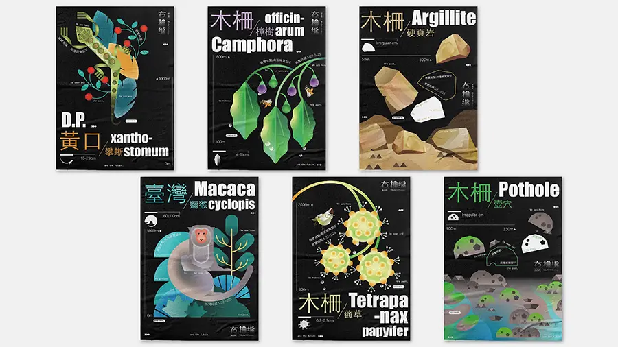
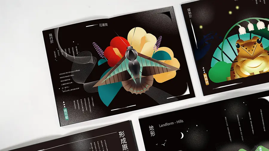
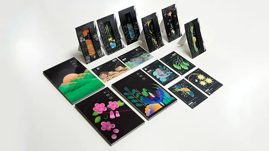
Inspired by the natural landscape of Muzha, Taiwan, where urban life meets the mountains, this project explores the relationship between people and their local environment.
Focusing on often-overlooked plants, animals, and geological features, the project transforms local knowledge into an engaging experience. Its creative approach aims to rekindle childhood curiosity and encourage a deeper appreciation of nature and biodiversity.
The projects featured here represent just a selection of the creativity and innovation recognised at the Design MasterPrize 2026.
Discover all the winning projects, including Product Design and Honorable Mentions, in the official Design MasterPrize Winners Gallery.