Egyptian creative director and art director Ramy Mohamed explores a fresh visual direction for DOMTY’s juice range, combining contemporary packaging design, expressive fruit imagery and imaginative advertising concepts.
The project centres on a simple idea: making flavour visible before the first sip. Vibrant colours, carefully composed fruit imagery and a clear visual hierarchy give each flavour its own personality while maintaining a cohesive identity across the range.
The creative approach extends beyond packaging into product visualization and an advertising concept titled “D for DOMTY — A Letter You Can Taste,” transforming a familiar brand element into a sensory visual experience.
Packaging Design: Making Flavour Visible
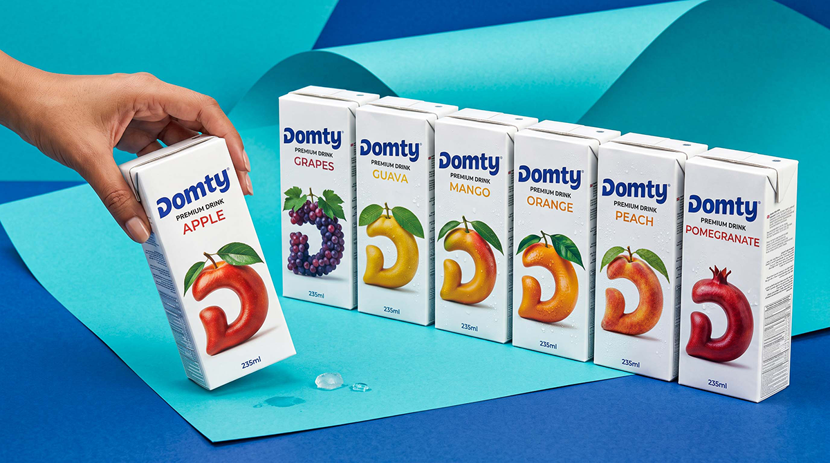
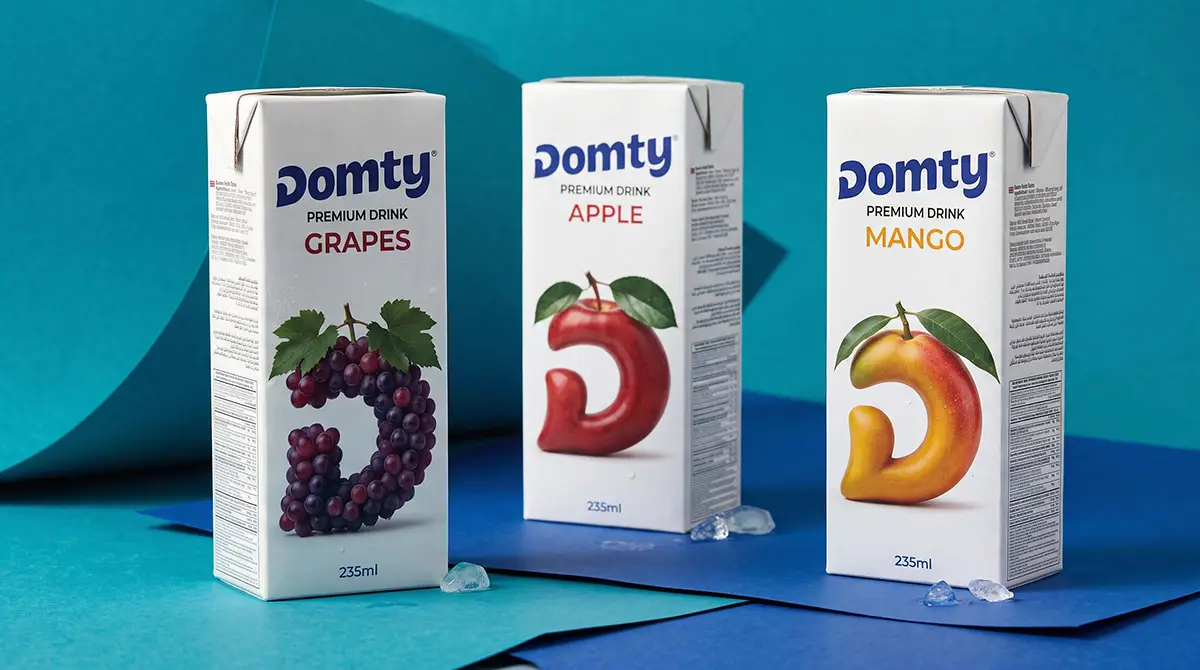
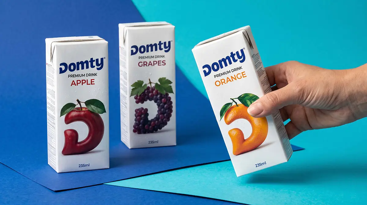
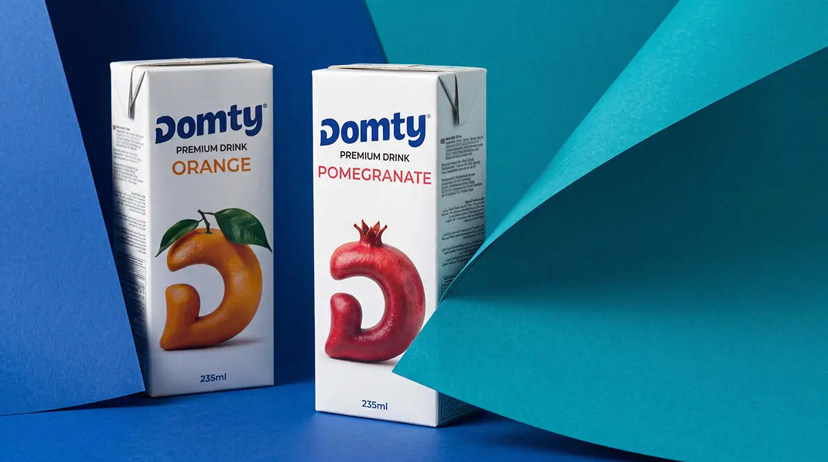
The packaging places fruit at the centre of the visual identity. Bold imagery, colour relationships and thoughtful composition communicate each flavour while establishing a clear balance between the DOMTY brand, product information and fruit.
Each carton has a distinctive character, yet the collection maintains a consistent visual language. The result is a contemporary, approachable and visually appetising packaging concept designed to stand out both individually and as a complete range.
Art Direction and Product Visualization
The product presentation introduces a refreshing visual environment dominated by blue and turquoise tones. Layered surfaces and Canson-paper-inspired textures provide a tactile backdrop, while lighting and shadows give the cartons depth and realism.
Through low-angle compositions, overhead perspectives and detailed close-ups, Ramy explores different ways of presenting the products without losing visual consistency. Hands holding or exchanging juice cartons add a human touch, connecting the designs to familiar everyday moments.
Together, these elements create a distinctive visual world that supports the packaging and strengthens the overall presentation.
D for DOMTY — A Letter You Can Taste
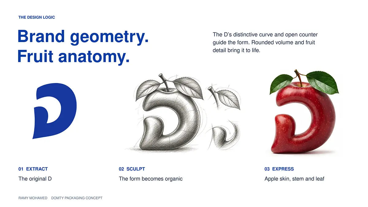
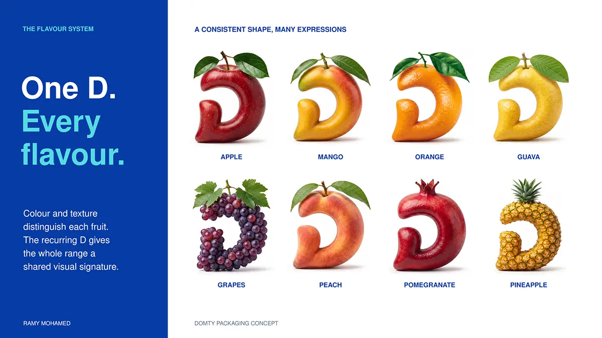
The advertising concept transforms the letter D, taken from DOMTY’s emblem, into a sculptural visual element that interacts with fruit, juice and light.
Under the line “A Letter You Can Taste,” the campaign explores eight flavours: guava, peach, pomegranate, pineapple, mango, orange, apple and grape.
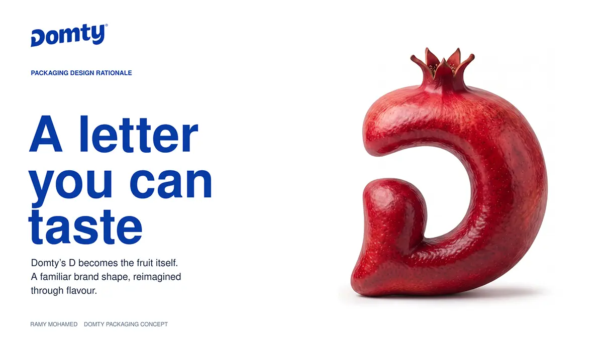
Each composition uses colour, liquid movement and translucency to reflect the character of its fruit, while the recurring D creates a recognisable connection across the series.
The result is a flexible creative concept that turns a simple brand element into an expressive symbol of flavour.
A Cohesive Creative Vision
From packaging to advertising, the project brings together brand recognition, expressive imagery and carefully considered art direction.
Packaging establishes the visual identity, product visualization creates an engaging environment, and the advertising concept gives the brand’s emblem a new dimension.
Together, they reflect Ramy Mohamed’s approach to building connected visual experiences across different forms of brand communication.
Project Credits
Brand: DOMTY
Creative Concept & Direction: Ramy Mohamed
Art Direction: Ramy Mohamed
Packaging Design: Ramy Mohamed
Advertising Concept & Visuals: Ramy Mohamed
Product Visualization: Ramy Mohamed
Presentation Design: Ramy Mohamed
Year: 2026
About the Designer
Ramy Mohamed is an Egyptian creative director and art director based in Cairo. His work spans advertising, brand communication, packaging design and visual storytelling, connecting creative concepts with their final visual execution.
Portfolio: https://www.behance.net/ramymohamed