Greece is one of the oldest wine-producing regions in the world. The earliest evidence of Greek wine has been dated to 6,500 years ago where wine was produced on a household or communal basis. In ancient times, as trade in wine became extensive, it was transported from end to end of the Mediterranean; Greek wine had especially high prestige in Italy under the Roman Empire. In the medieval period, wines exported from Crete, Monemvasia and other Greek ports fetched high prices in northern Europe.
The origins of wine-making in Greece go back 6,500 years and evidence suggesting wine production confirm that Greece is home to the second oldest known grape wine remnants discovered in the world and the world’s earliest evidence of crushed grapes. The spread of Greek civilization and their worship of Dionysus, the god of wine, spread Dionysian cults throughout the Mediterranean areas during the period of 1600 BC to the year 1. Hippocrates used wine for medicinal purposes and readily prescribed it.
Greek wines and their varieties were well known and traded throughout the Mediterranean. The Ancient Greeks introduced vines such as Vitis vinifera and made wine in their numerous colonies in Italy, Sicily, southern France, and Spain. The Vitis vinifera grape which thrives in temperate climates near coastal areas with mild winters and dry summers adapted well and flourished in the Northern Mediterranean areas. The most reputable wines of ancient Greece were Chian, Coan, Corcyraean, Cretan, Euboean, Lesbian, Leucadian, Mendaean, Peparethan wine, Rhodian and Thasian.Wine was also important for ancient Macedonia. Two other names may or may not be regional: Bibline wine and Pramnian wine are named in the earliest Greek poetry, but without any reliable geographical details.
In 1937, a Wine Institute was established by the Ministry of Agriculture. During the 1960s, retsina suddenly became the national beverage. With rapidly growing tourism, retsina became associated worldwide with Greece and Greek wine. Greece’s first Cabernet Sauvignon vineyard was planted in 1963. In 1971 and 1972, legislation established appellation laws.
(source: wikipedia)

Greeck Best Wine Packaging and Label Design, 2013-2014
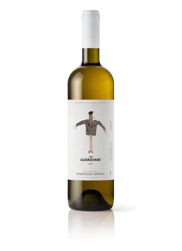
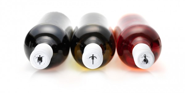
THE GUARDIANS by Mousegraphics | Greece
“The client gave us freedom to think in any possible direction in order to create not just an interesting but -if possible- a unique idea. This is an old family of prestigious winemakers with close ties to the land, the vineyards and even the unique buildings situated since the 19th c. in historic buildings, at the areas of Mantinea and Nemea in the Peloponnese. Updated with organic farming methods, the company’s activity aims to produce high quality grapes and wines while protecting the ecosystem and the environment. All the above inspired a design based on the age old figure of the vineyard guardian: the scarecrow. An item of folk art, of basic necessity and common practice, the scarecrow has been the object of fascination by artists and village people alike. Festivals are organized around the world to celebrate the imagination and ingenuity involved in its making. Mousegraphics commissioned V. Karouk, a well known Greek artist to draw and then construct three different life-size scarecrows to represent the white, red and rose labels. They were then photographed by T. Vrettos a fashion and art photographer, with equal care. The brand name “the Guardians” is accompanied on the packaging by the small phrase: “to serve and protect the secrets of good wine-making”, and this summarizes our concept and its references.”


ANATHIMA by Mousegraphics | Greece
“We started from the simple fact that, people value wine as an offering from the heart for those they consider friends and family. Our research led to the old Greek word Anathima, which means the votive offering. From antiquity to the present, anathimata are connected with the humans’ wish to gratify, to implore and praise: a means to adress the sacred and approach it via the ritual and respectful offer of a precious gift. Greek temples, oracles and, more recently, churches, are full of such objects which are usually miniature effigies, body parts, human or animal figures, homes and beloved possessions. They all narrate life stories about relationships, love and the fear of loss, in linear, simplified, gold or silver, portable images. We chose to render the word in latin letters, with the exception of the, strongly differentiated, Greek letter thita (θ), which clearly alludes to national provenance. It was obvious that even an international audience should be reminded that wine, was the present of god Dionysus to humanity, a present also related with inspiration and community. Embossed on the simple dark bottle, the silver colored anathima of a soldier’s figure, turns this bottle into a rich experience.”


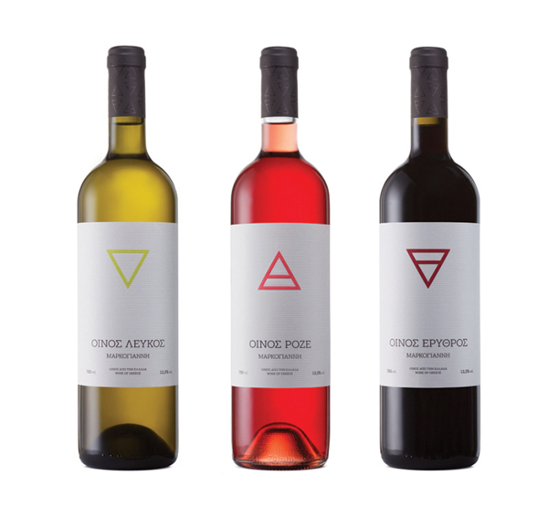
4 ELEMENTS by Christ Trivizas | Greece
“Inspiration for the labels came from the four elements of nature (water, earth, air and fire), also inextricably linked with the creation of these spirits. The color of the wines led to the choice of the corresponding symbols, while the high concentration of alcohol in the ‘tsipouro’, led to the assignment of the symbol of fire.”

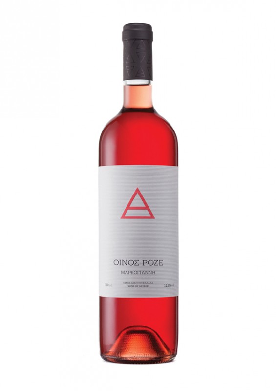

CHARDONNAY MARKOGIANNI by Christ Trivizas | Greece
“The label of Chardonnay Markogianni has been designed with the aim to lure the consumer to an interactive game down memory lane. It urges him, after he has enjoyed this extraordinarily delectable chardonnay, to preserve the memory of the pleasure he felt by dating the bottle and copying on the label itself the phase the moon was in on that particular night. So, each bottle acquires a meaningful uniqueness which recalls to the consumer’s mind the happy moments he spent drinking its contents.
The selection of a serif typeface (Garamont) in the composition of the label emphasizes the timeless values and the history of the Markogianni Estate, while its black color refers one to the moonlit night, supporting the concept of the “phases of the moon”.”


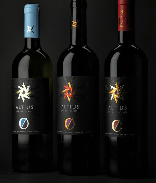
ALTIUS WINES by Noon Design | Greece
“Messimvria, the name of the winery that also marks its location in Northern Greece, means “meridian” in Greek and “midday” too, the moment when the sun crosses the meridian and is about its highest elevation in the sky. Inspired by this we named the wines “ALTIUS”, the latin name for “higher”. At this growing zone the sun sets the ideal conditions to produce high quality wines. Two typographic elements prevail on the label and symbolize Sun and Earth. The sun is formed by the rotation of the letter A (ALTIUS) and the earth by the letter O and the backlash glyph.”


DOMAINE GEROVASSILIOU by Red Creative | Greece


PAPOUTSI VINEYARDS by Sophia Georgopoulou | Greece
“Papoutsi Vineyards (Αmpelones Papoutsi) is a company that sells premium quality wine, in low price, directly from their vineyards to your door, through their website. Their philosophy is that everyone deserves to have good quality wine at his table! The logo is inspired by the Greek sun. Rough, abstract sketches decorate the wine labels, creating stories and dreams.”


AGGELON GI by Sophia Georgopoulou | Greece
“Aggelon Gi Estate (Angels’ Land in greek) launched a series of wines with a message of hope and optimism in the middle of Greek crisis since their label was inspired by the legendary Greek poet’s Odysseas Elytis’ quote: If Greece was distroyed completely, all it would take to rebuild would be an olive tree, a vine and a boat.”


FILIREA GI by Zafeiriadis Christos | Greece
“Packaging design for limited production homemade wine. The illustration depicts the process of creating wine from the harvest to the bottling. Printed with silk-screen printing method on paper that is wrapped around the bottle to convey the sense of handmade.”


ADAMANTINO by Noon Design | Greece
“The name “Adamantine” describes metaphorically the character of this fine wine. Geometrical reflections -like those of the diamond sides- span throughout the entire range of the label and become distinguished from the background with the print of spot UV varnish. Right at the center of the label the rhombus shape has been created by the vertical permutations of the capital letter A. We used golden foil for the red wine and silver for the white one. It is the strong glow of the diamond on the rough surface of the paper. Simplicity and minimalism characterize this label design, expressing this way the sacramental conversion of raw materials from vineyards in bright wines with a special value.”


Some more amazing wine packaging and label designs from Australia, UK, USA, Austria, Spain, New Zealand
BAMBOOZLE by The Creative Method | Australia
“The labels almost fully wrap around the bottle and the main front facing section contains a black and white optical illusion. These illusions tie in with the name Bamboozle and the drink itself, where things are not as they seem. The solution began with a tasting session where all the designers were involved in sampling the product – some more than others! It was during this tasting session that it was noted that there was an unusually high taste of passion fruit notes. Some even wondered if passion fruit had been added to drive more fruit flavor. The wine however, was made in the traditional style and no extra fruit or ingredients had been added. This discovery got us thinking about how there was some sort of illusion happening and from here we started playing round with images and names that would best bring this idea to life.”


THE AQUARELLE ESTATE by London Studio | New Zealand
“The client’s brief… To develop a new brand for a range of New Zealand wines that will be sold internationally. The branding would need to be identifiable and unique enough to stand out in a cluttered international market but still be expandable for future additions to the product range.
Our direction for the design… The concept for the brand originated from our clients two great loves, painting and the French language. The Aquarelle Estate (french for watercolour) was born. A wine glass water colour graphic combined with white spaces and clean typography were used to draw attention on the shelf and help consumers to identify their preferred drop. The Cuvée Brut was positioned to be more gift-able with a carton design, then finally a range of stationery was created to unify the brand.”


ROTHSCHILD COLLECTION by Paul Belford | United Kingdom
“Waddesdon Manor is the historical country seat of the Rothschild family in the UK and home to Waddesdon Wine, the official distributor for the Rothschild collection of wines. The identity is designed to balance the rich tradition associated with Rothschild wines with a more modern approach to the wine business.”


SAFEWAY BOTTLE SLEEVES by Stranger & Stranger | United Kingdom – United States
“The idea came from our own No.13 pack. We created brands in a packaging format that stands out and adds value, interest and gifting opportunities. The added real estate that the over sleeve gives us has allowed us to engage with people in a way that a tiny back label never can. Everyone just wants to pick up and read these packs.”


Vi NOVELL 2013 by Atipus | Spain
“This is a fresh and fruity wine which is bottled before its fermentation is finished. Therefore, it must be consumed within a short space of time. As it is bottled coinciding with the celebration of the slaughtering of the pig we were inspired by the traditional identities of local butchers.”


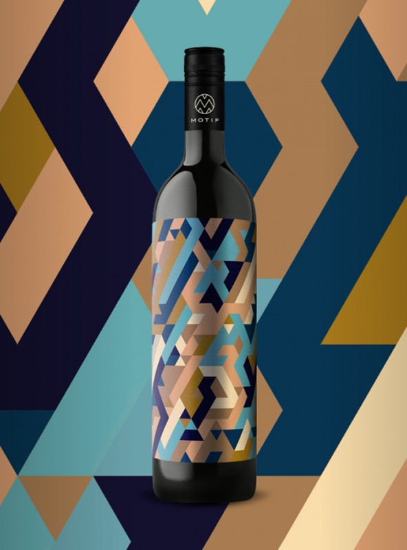
MOTIF WINE by EN GARDE Interdisciplinary | Austria – Germany
“Motif is different. Motif is disinterested pleasure that one sees in the glass. Six different wines of the estate without the usual pattern Gamlitz in the wine world supply and descriptions.
Motif, from the French as much as pattern, motif suggests addition of the name similarity to the family pattern and the nexus to the subject on the label. The sixth sense was GARDE Together with John Early Man and Mario Rampitsch of EN created that transforms the taste and olfactory response in a visual motif. Expressions of the vernacular as gschniglt, wax or bixgrod give the wine character. A kind of personality mirrors that will reveal that wine is as versatile as the mood, society and situation in which one enjoys it.”


LUCHADOR SHIRAZ by Morning Breath | United States


DX ROBLE by Armoder Arte & Diseño
Designer: Giovanni Acquaviva | Spain
Client: Bodegas Los Pinos · Fontanars dels Alforins ·Valencia · Spain
Winery Los Pinos entrusted us the creation of a wine label, whose premise was to design,in black and white, the figure of a horse: “Distinguished X”, pure Spanish breed horse. We created the logo DX, designing a typeface of minimalist line, together with a game of clean and pure lines, shaping the noble and elegant silhouette of “Distinguished X”.