Doretypo was born accidentally, during the design of a poster for a jazz festival in Rome. Rosario Nocera, the font designer, was going to realize a typesetting, but he could not find the right character and decided to draw the letters he needed, starting from the first letter of the headline, capital ‘M’. He was looking for a lettering able to evoke musical notes, where each letter could be linked to the following one, to the previous one, to the largest at the top and the smallest at the bottom. From this idea doretypo came to life gradually.
In the beginning there were a few medium capital letters with very few glyphs, but given the good results Rosario decided to decline in light and bold, integrating minuscule letters, for a whole of 374 glyphs.
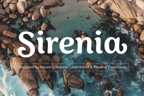
Today doretypo OpenType is a family of fonts with three weights, 374 glyphs, supporting about 57 languages, ligatures standard, plus a new ‘NY’. Moreover, each glyph can be used individually to create textures and graphic symbols.


YOU MAY PURCHASE THIS FONT AT: http://www.myfonts.com/fonts/rosario-nocera/doretypo/